From Print to Film: How Joel Holland’s Type for ‘The Thursday Murder Club’ Made the Cut
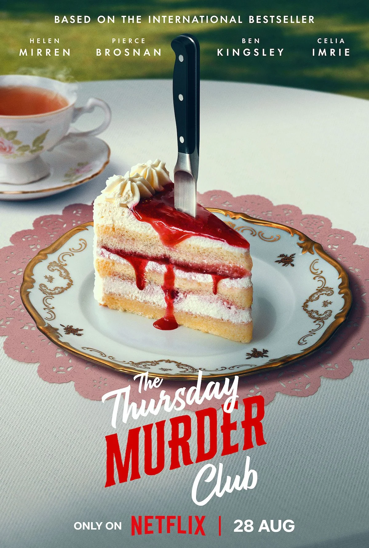
When a bestselling book gets the inevitable screen adaptation, typography is often the first casualty. But not so with The Thursday Murder Club. Joel Holland’s hand-lettered title, which defined the visual identity of Richard Osman’s hit mystery series, has made a clean—and surprisingly faithful—leap from the book covers to the big screen.
Holland’s lettering, a distinctly irregular script with generous curves and compact rhythm, first appeared on Osman’s debut in 2020 and has since adorned each instalment of the series.
Designed to evoke the warm, eccentric tone of the novels, the type manages a careful balancing act: neither too cosy nor too comedic. It’s a typographic wink—wry, self-aware, and totally in sync with the book’s tone.

Original book cover design
In an industry where film posters often default to modular sans serifs or condensed caps, it’s notable that Amblin Partners and Netflix opted to retain Holland’s lettering in the movie’s teaser artwork. The choice signals a rare commitment to continuity between the publishing and cinematic worlds. It also suggests a shift in how studios view branding—not just as visual shorthand, but as part of the story’s texture.
The new posters and teaser visuals carry over the typographic DNA almost exactly, preserving Holland’s original lettering in the lock-up while adapting its weight and spacing to fit widescreen formats. It’s not a facsimile. It’s the same type, reborn for film. Credit here goes not just to the designer but to a production team willing to see the value in authorial design language.
Whether this typographic fidelity carries through into credits, trailers, and merchandise remains to be seen. But for now, it’s a quiet victory for design integrity in adaptation culture.

Further reading