Hand Drawn Illustration: Why Rob Nicol is a Refreshing Antidote to "Gray Goo" Illustration

Illustration by Robert Nicol for Bowdoin Magazine
There’s a particular kind of clarity that only comes from something made by hand. You see it immediately in this commission illustrated by Robert Nicol for Bowdoin. It’s in the looseness of the line, the slight imbalance, the decisions that feel instinctive rather than calculated.
Nothing is over-resolved or smoothed out for the sake of polish.
Instead, the work leans into its own irregularities, those small shifts in proportion and texture that give it a pulse. It’s that sense of movement, of something still alive in the mark-making, that holds your attention.
Set against the backdrop of increasingly uniform visual language, what’s nowadays described as ‘grey goo’, Rob’s kind of work feels all the more distinct and aligns with a broader return to a more human handdrawn aesthetic in 2026, particularly across editorial and print.
Not as nostalgia, but as a recalibration and a recognition that real personality (visible personality) is what cuts through the noise.
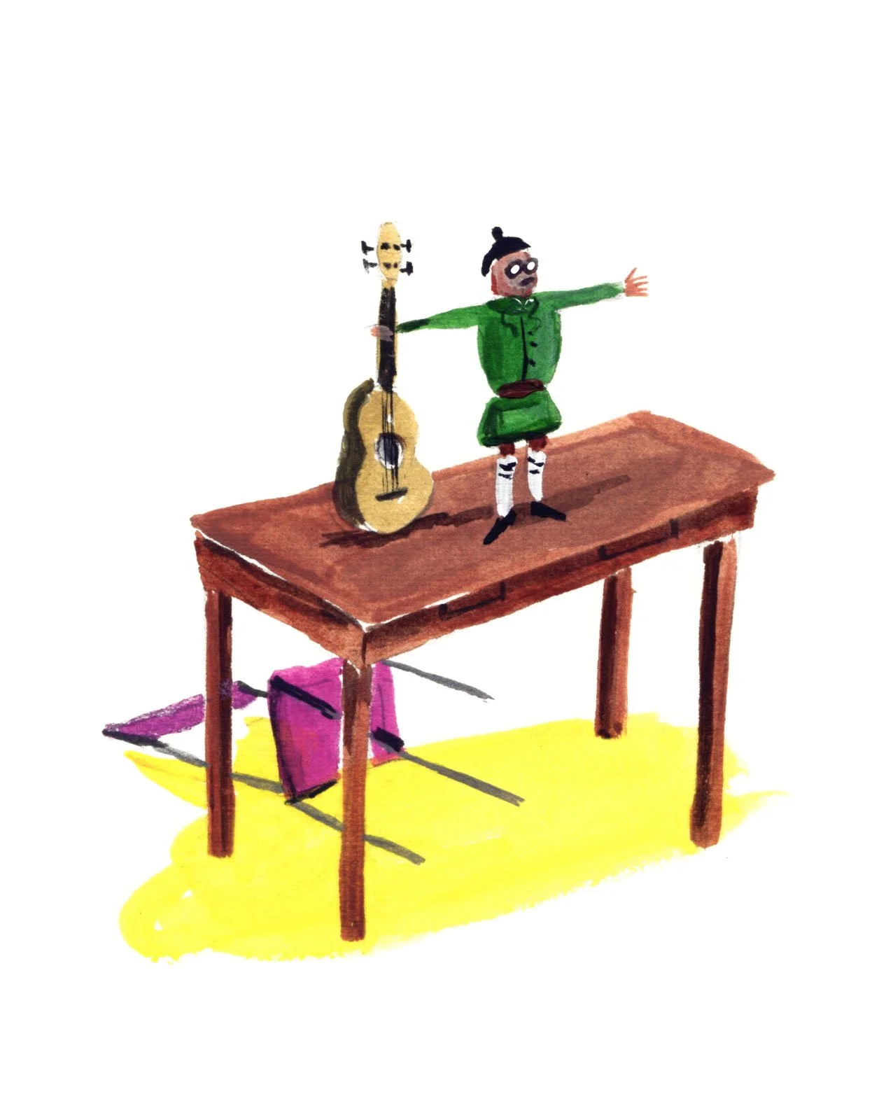
In Rob’s case, it shows up as what i describe as ‘visual friction’. His figures aren’t perfect. Compositions are off tilt and colour is painted with just enough tension.
With an education from Glasgow School Of Art and an MA from the Royal College of Art, there’s a confidence in Rob’s work, perhaps in letting things remain a little unresolved.
The result is work that communicates an idea while carrying the trace of how it was made… and it’s that trace that matters.
It’s what gives the image its edge and give it soul.
And in this commission, it’s exactly what I love seeing. Making it memorable…and fun.
The Power of Textured, Hand-Drawn Illustration
Rob’s recent work for Bowdoin Magazine is a masterclass in how textured illustration tells a deep, resonant story.
While others rely on digital filters for a "painterly" look, Rob provides the authentic analog illustration experience that showcases the physical friction of the brush and the organic grain of the paper.
Just look at these illustrations. They warm the heart with personality and depth.
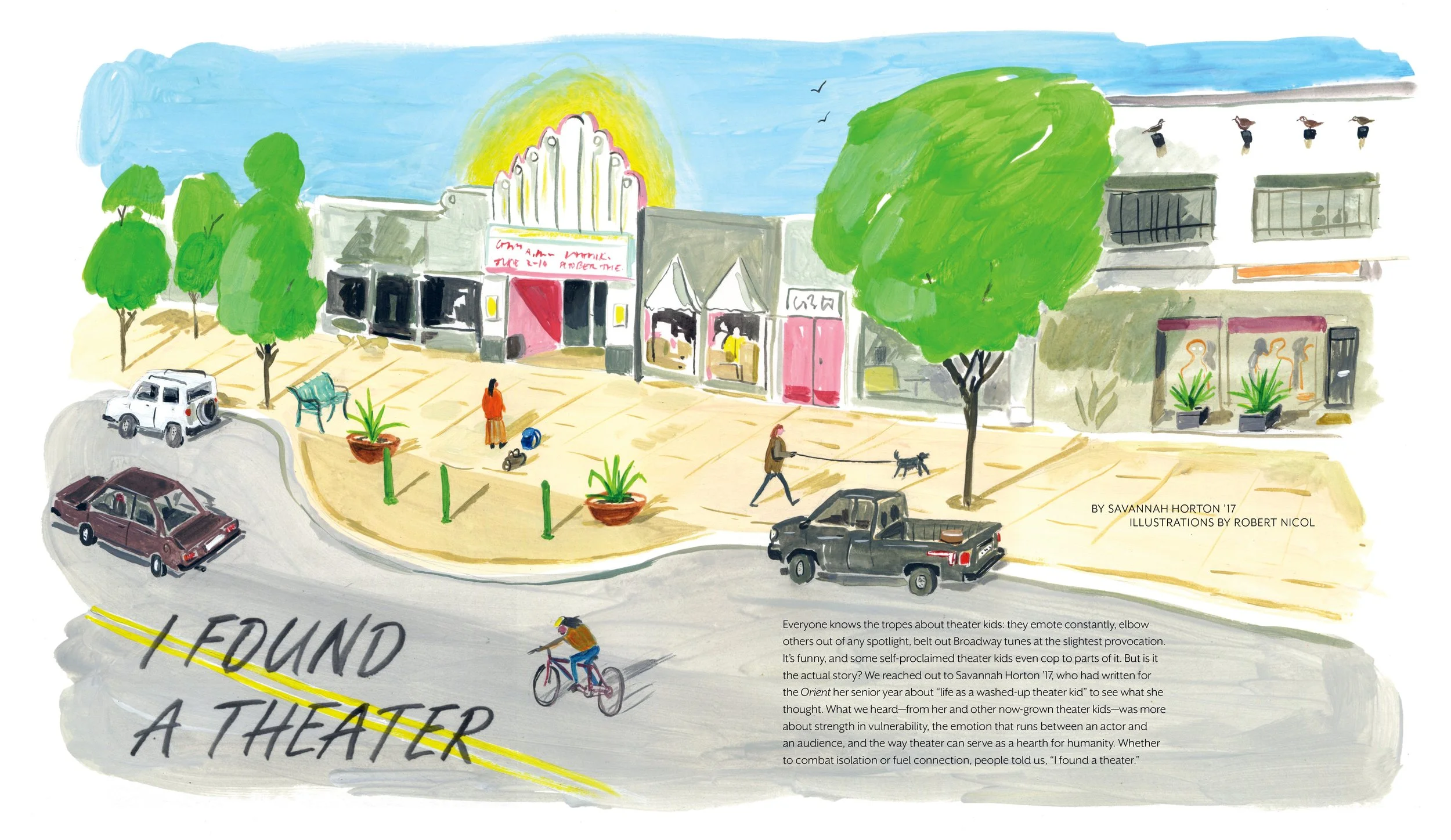
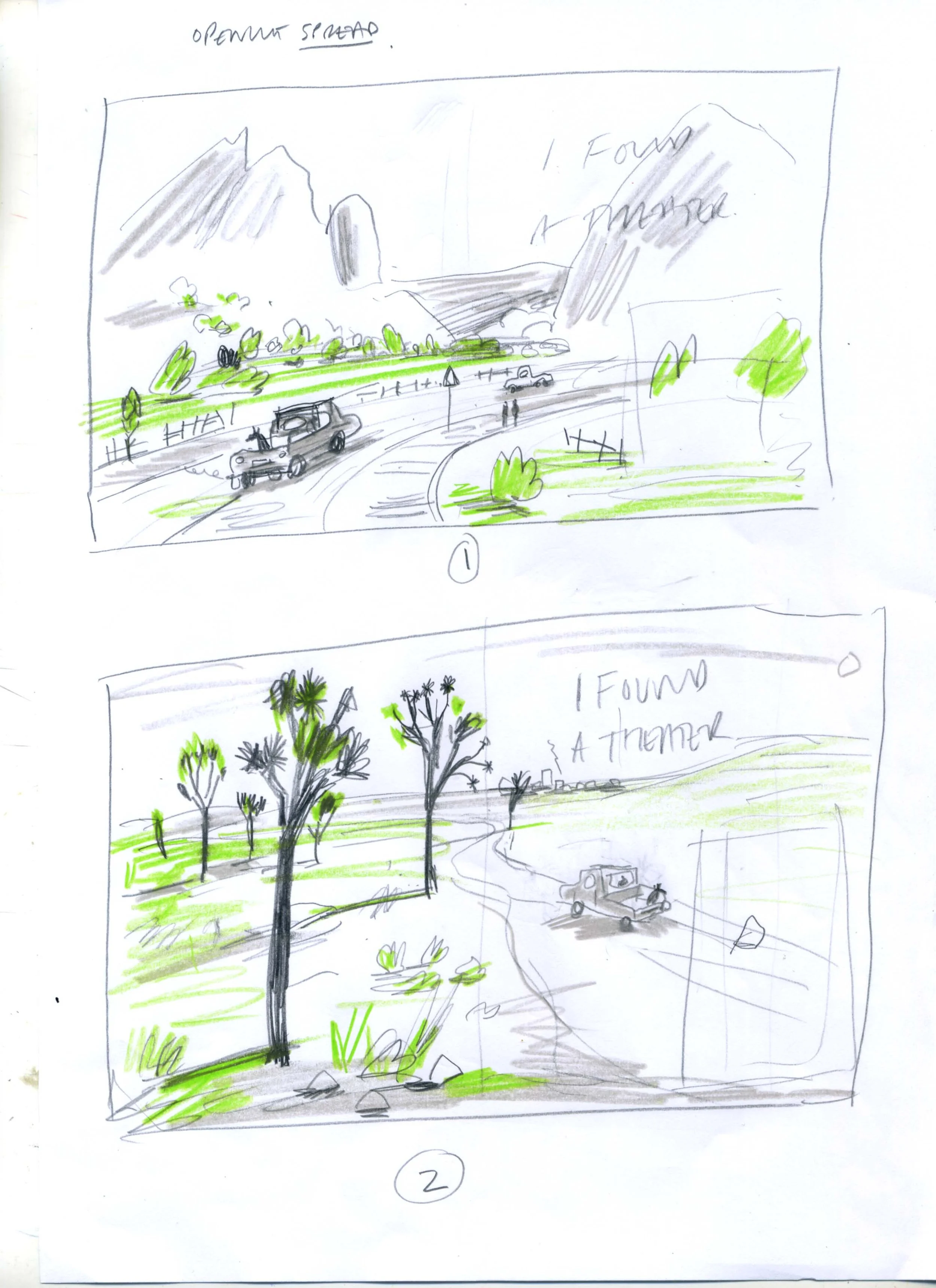
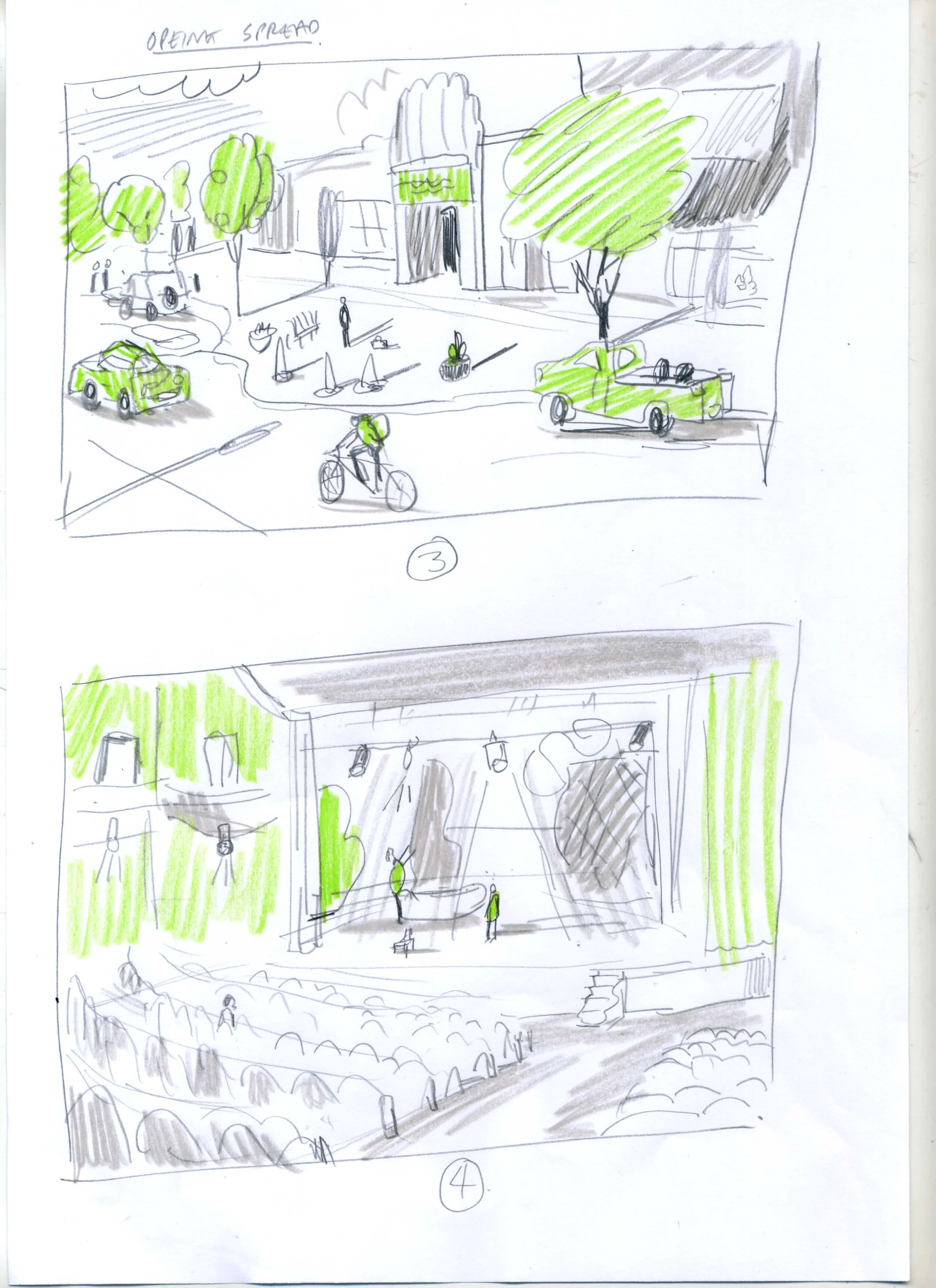
I always love seeing Rob's work, both in his static illustrations and his hand-crafted animations. His lines possess an undeniable character that invites the viewer into a narrative that speaks volumes. His work for the feature "I Found a Theater" shows that human aesthetic defined by visible paint marks, ink bleeds, and a charmingly "wonky" perspective.
Why Real Paint Trumps AI Code
The 2026 trend centers on hand-drawn illustration that feels honest. Rob, a graduate of the Glasgow School of Art and the Royal College of Art, uses his elite background to map a singular, expansive interior world onto the page.
Physical Mark-Making:Rob’s work celebrates the act of painting, creating a sensory experience that feels grounded and authoritative.
Unique Visual Style: The characters and environments Rob creates have a "soul" born from a human process of trial, error, and imagination.
Beyond the Prompt:Rob brings specific, clever choices to life—like the President in a wheelchair or the raw energy of a theater rehearsal—that an algorithm cannot conceive.
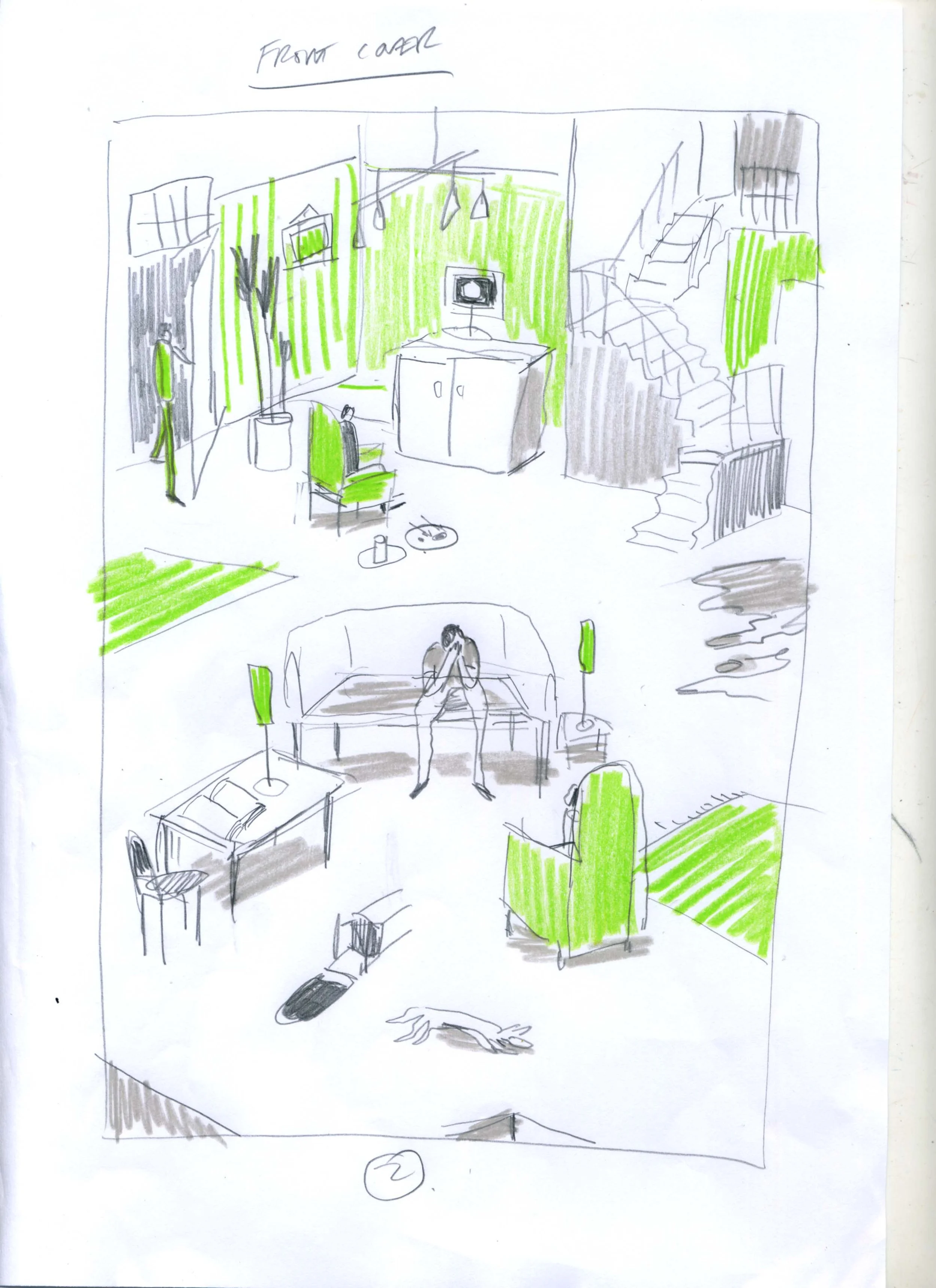
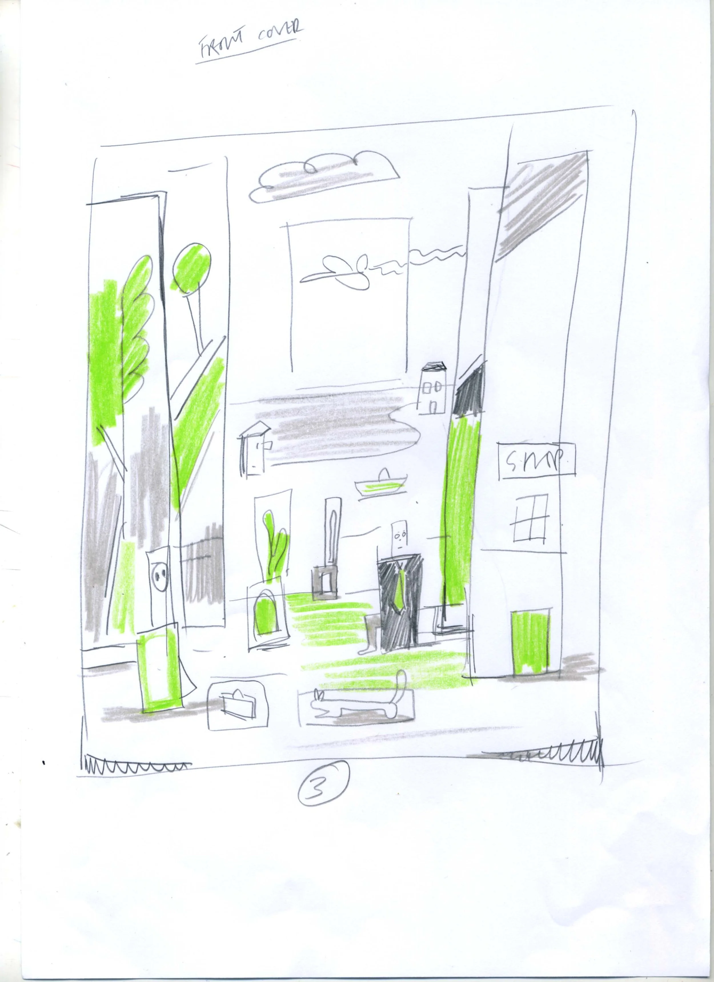
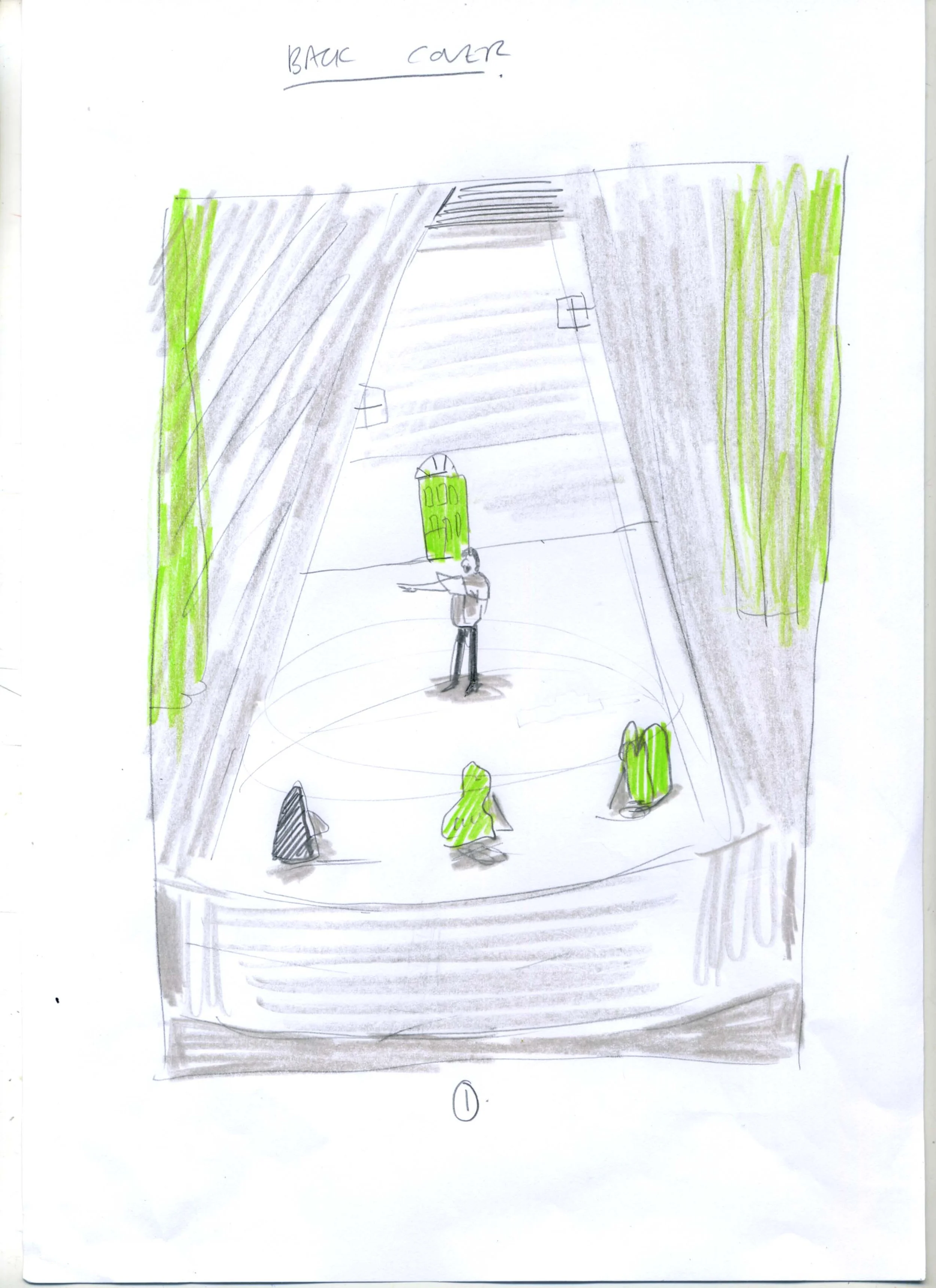
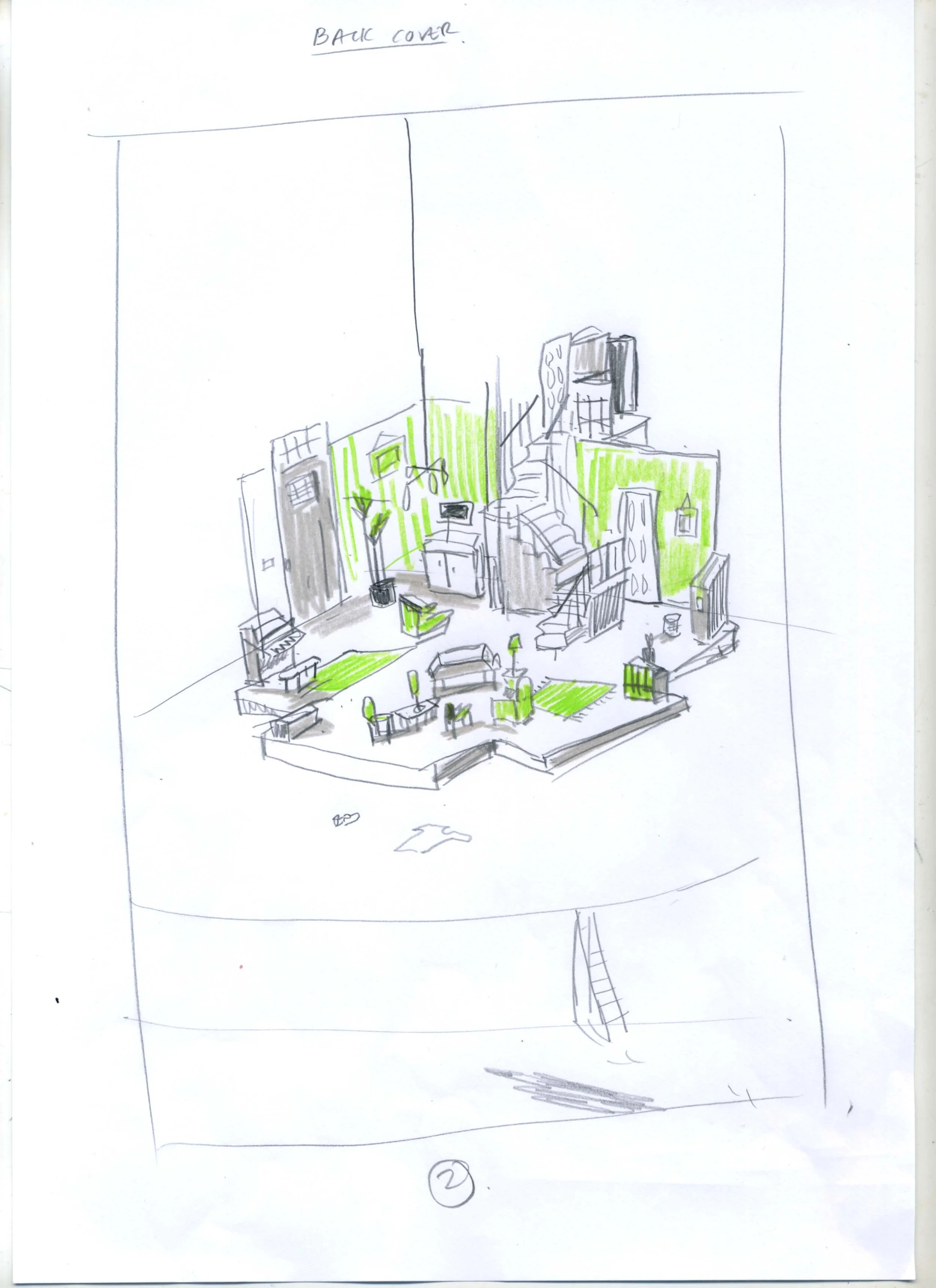
From Sketch Ideas to Final Artwork - How it works…
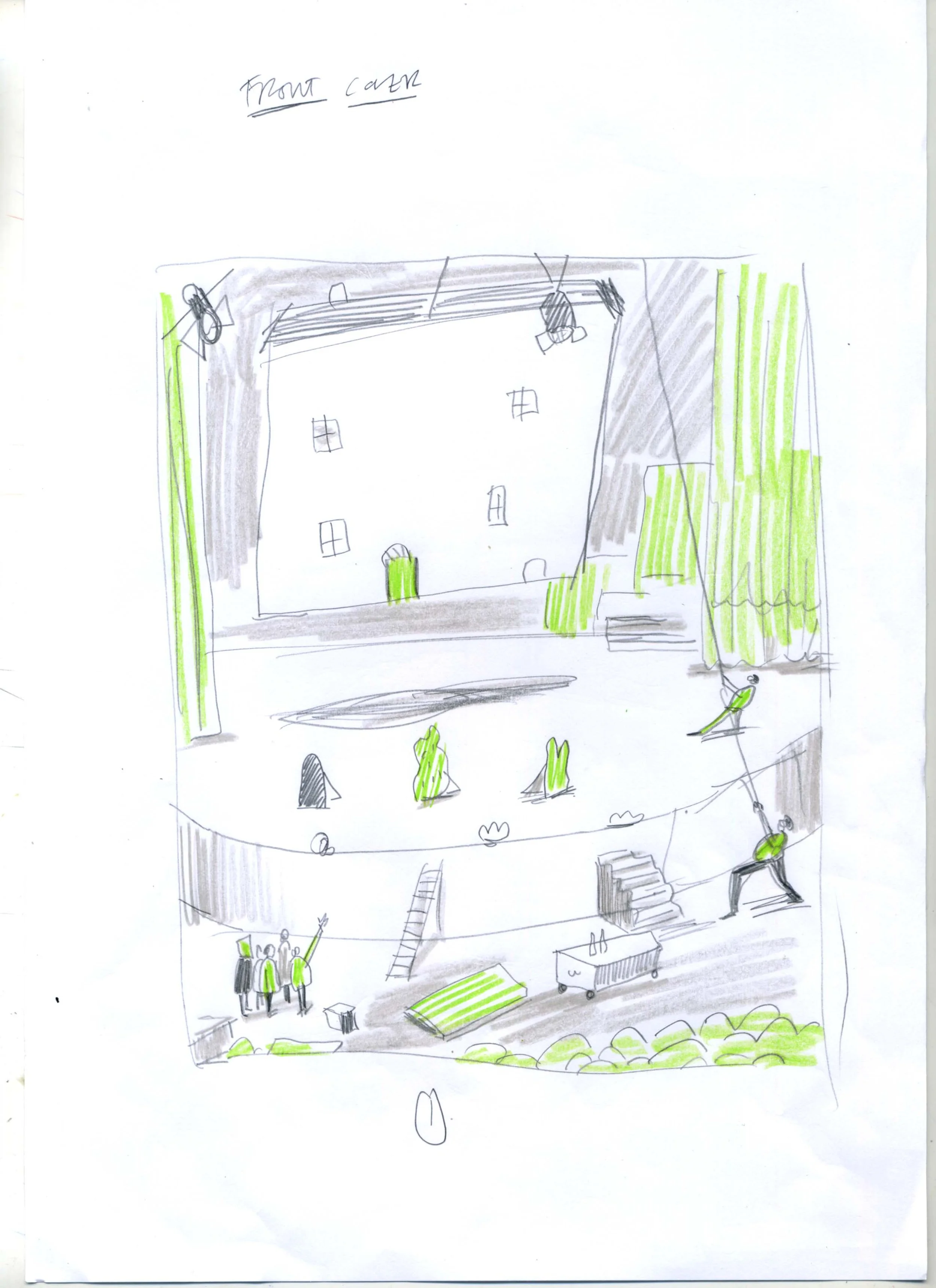
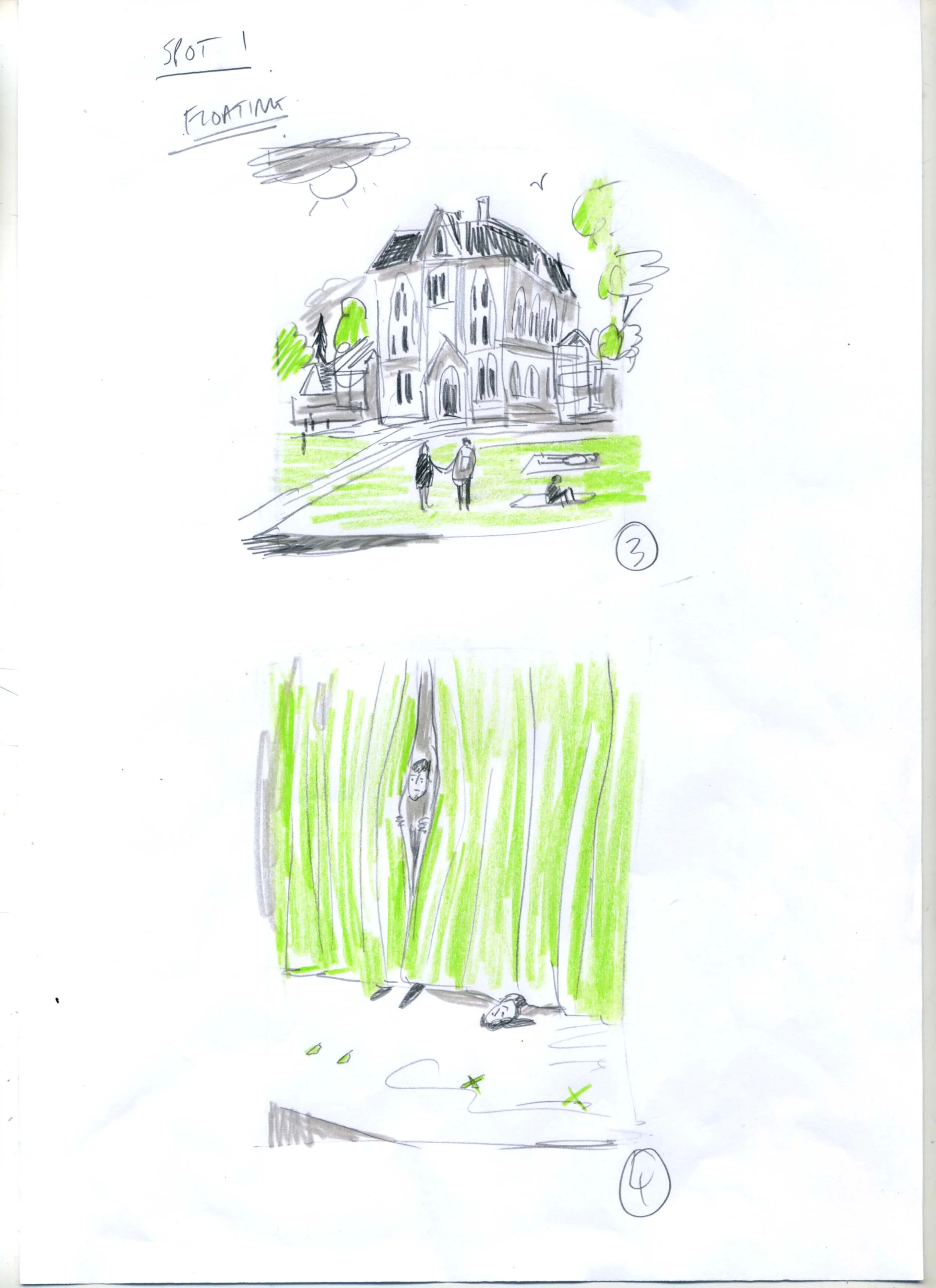
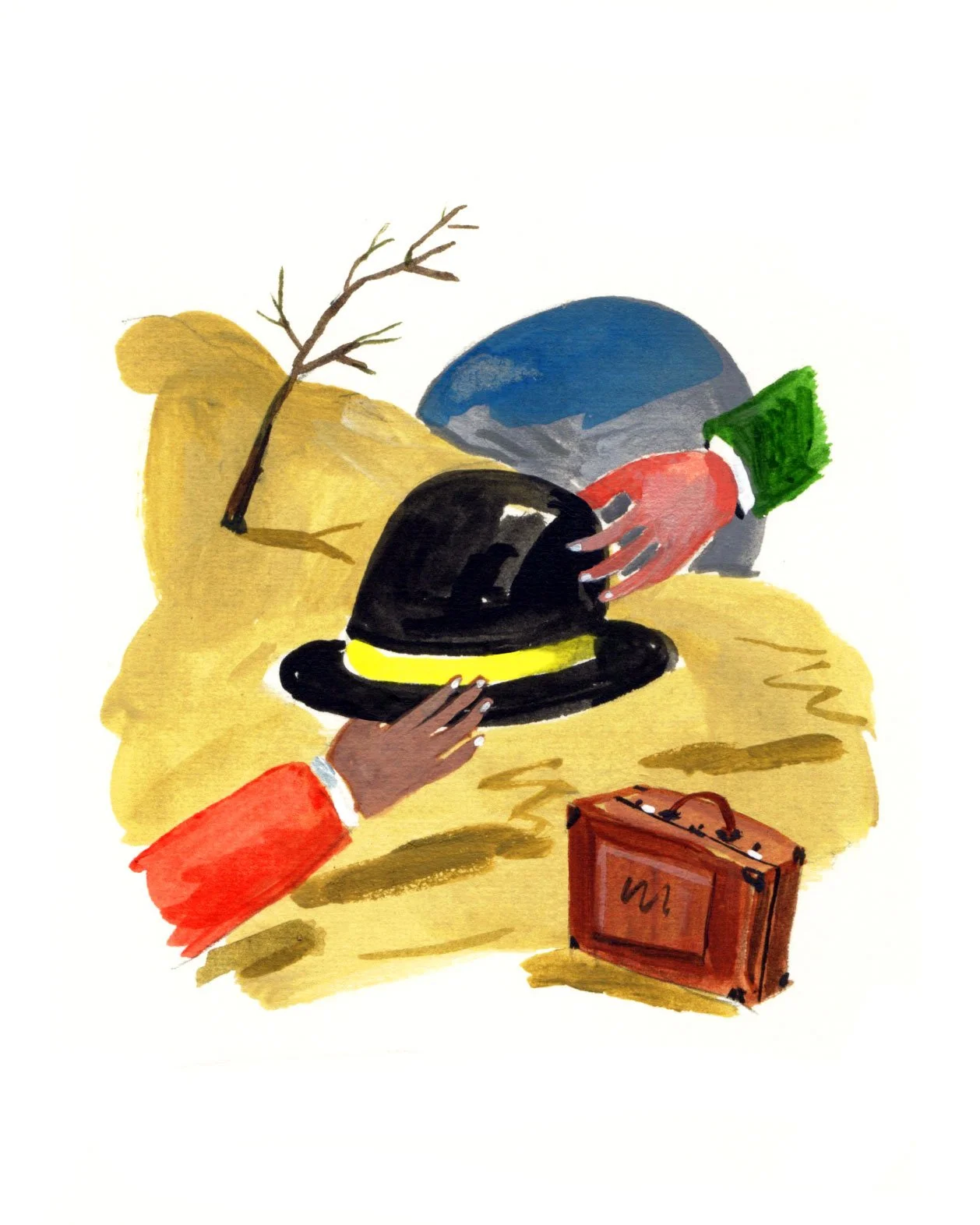
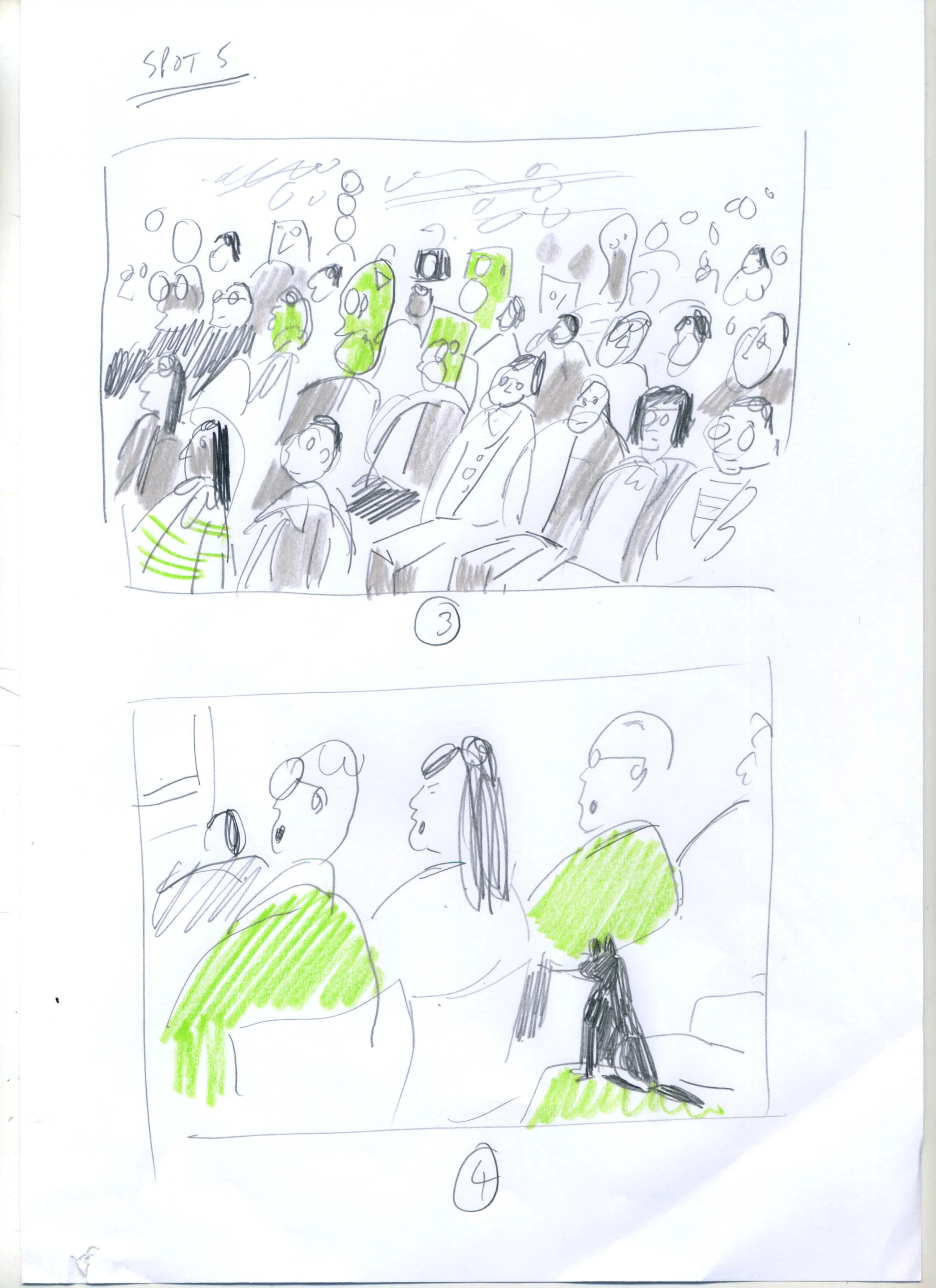
Comparing Rob’s initial sketch ideas to the final spreads reveals the true value of analog illustration. He always offers various starting points for the illustrations sketching out different creative solutions.
The transition from a raw pencil spark to a finished, textured illustration is a record of a human mind at work.
By finishing the work by hand, Rob ensures the ink splatters and paint grains remain, signals that tell an audience they are looking at an authentic piece of art.
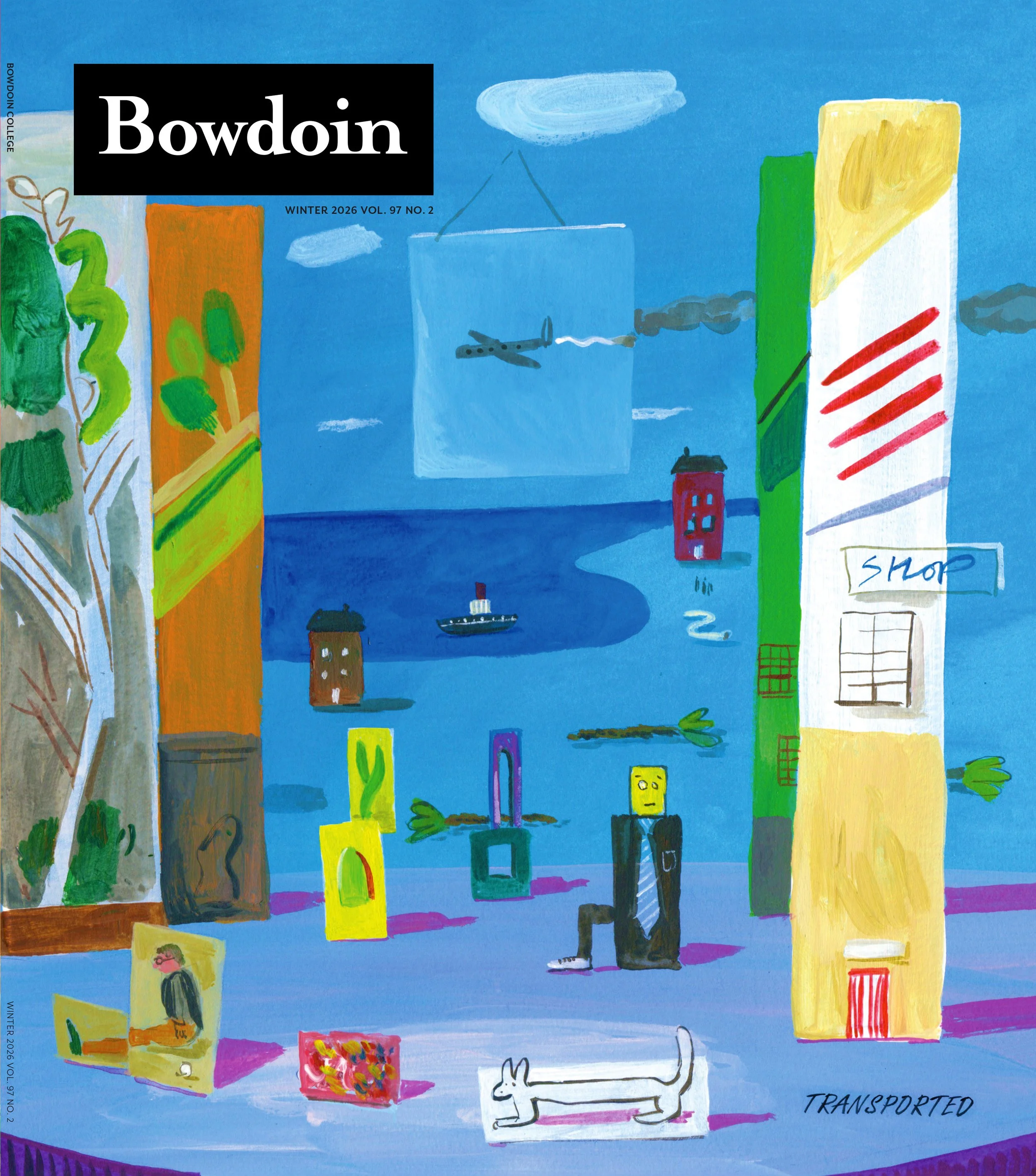
Cover Artwork. Sketch ideas and final art
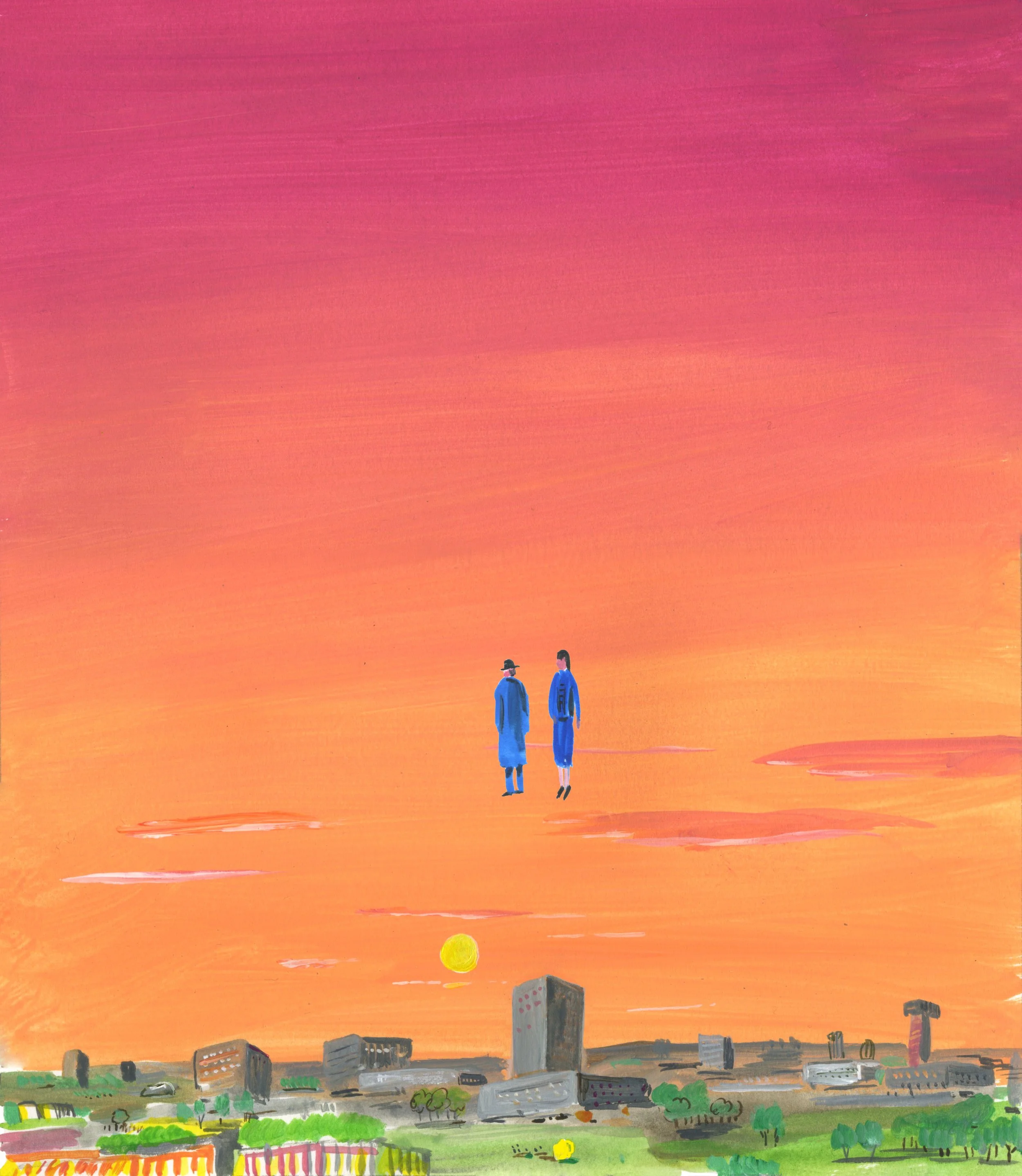
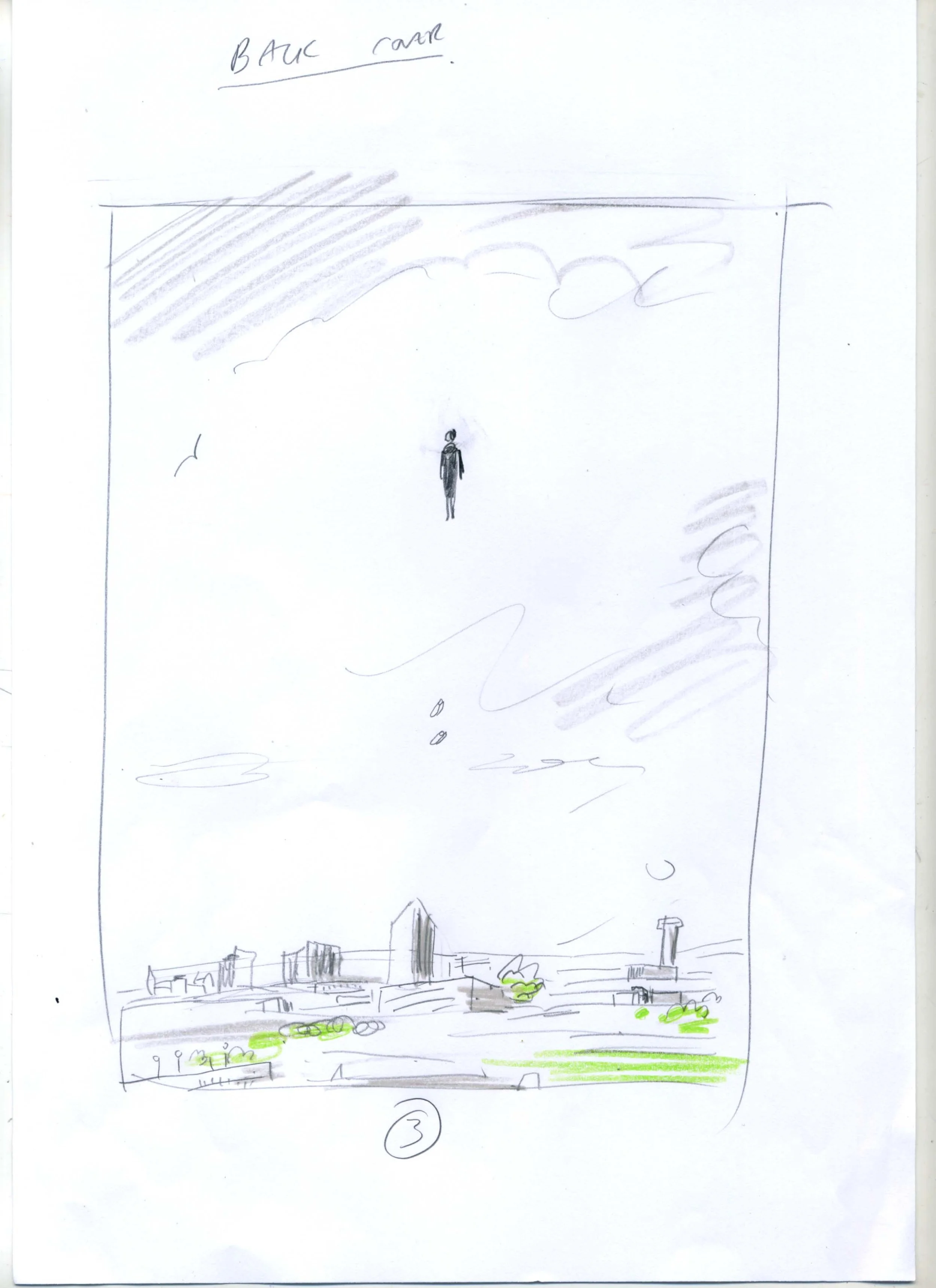
Back Cover Sketches and Final Artwork
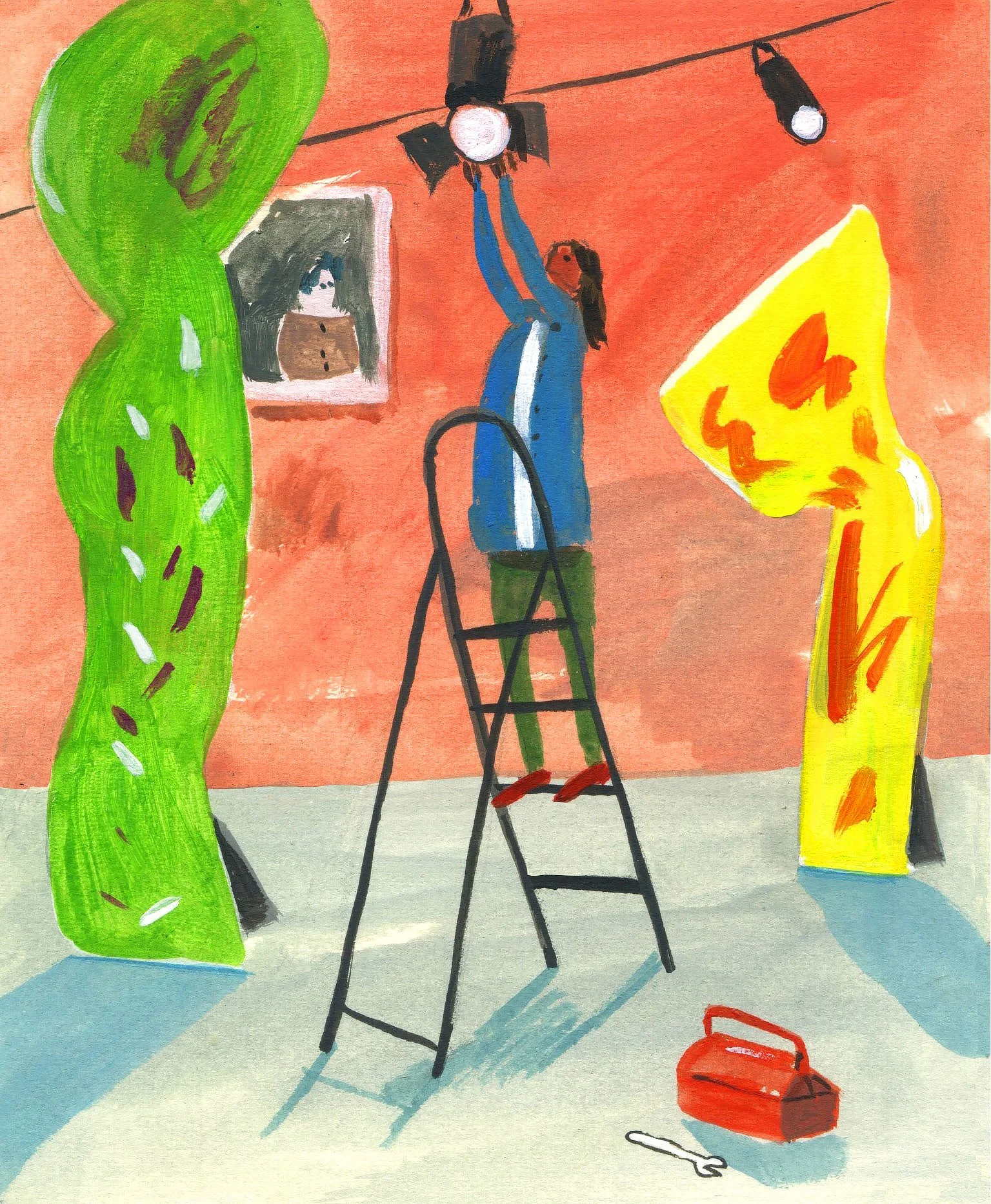
Opening spread. Sketch ideas and Final Art
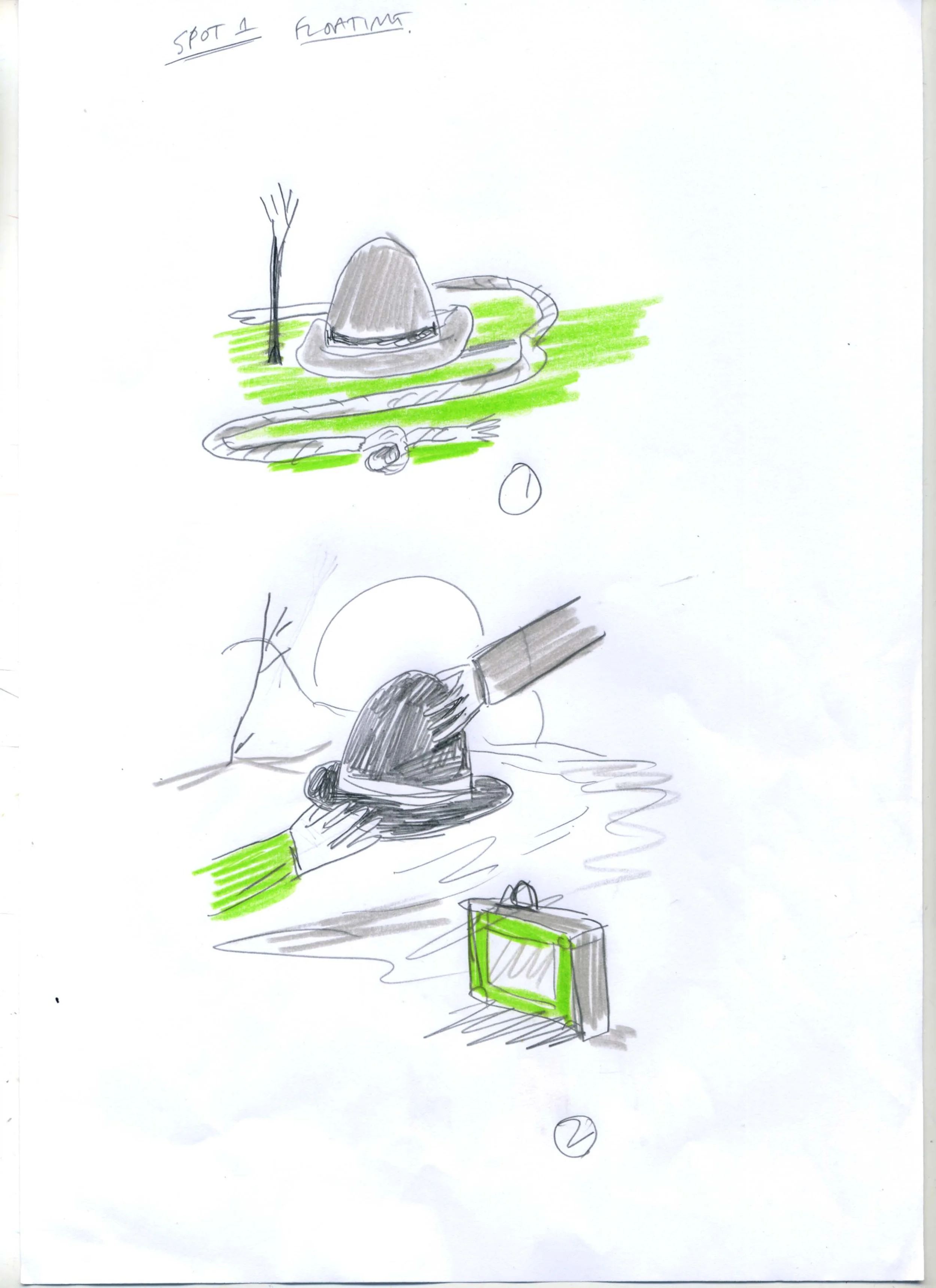
Spot Illustration (1) - Sketch ideas and final art
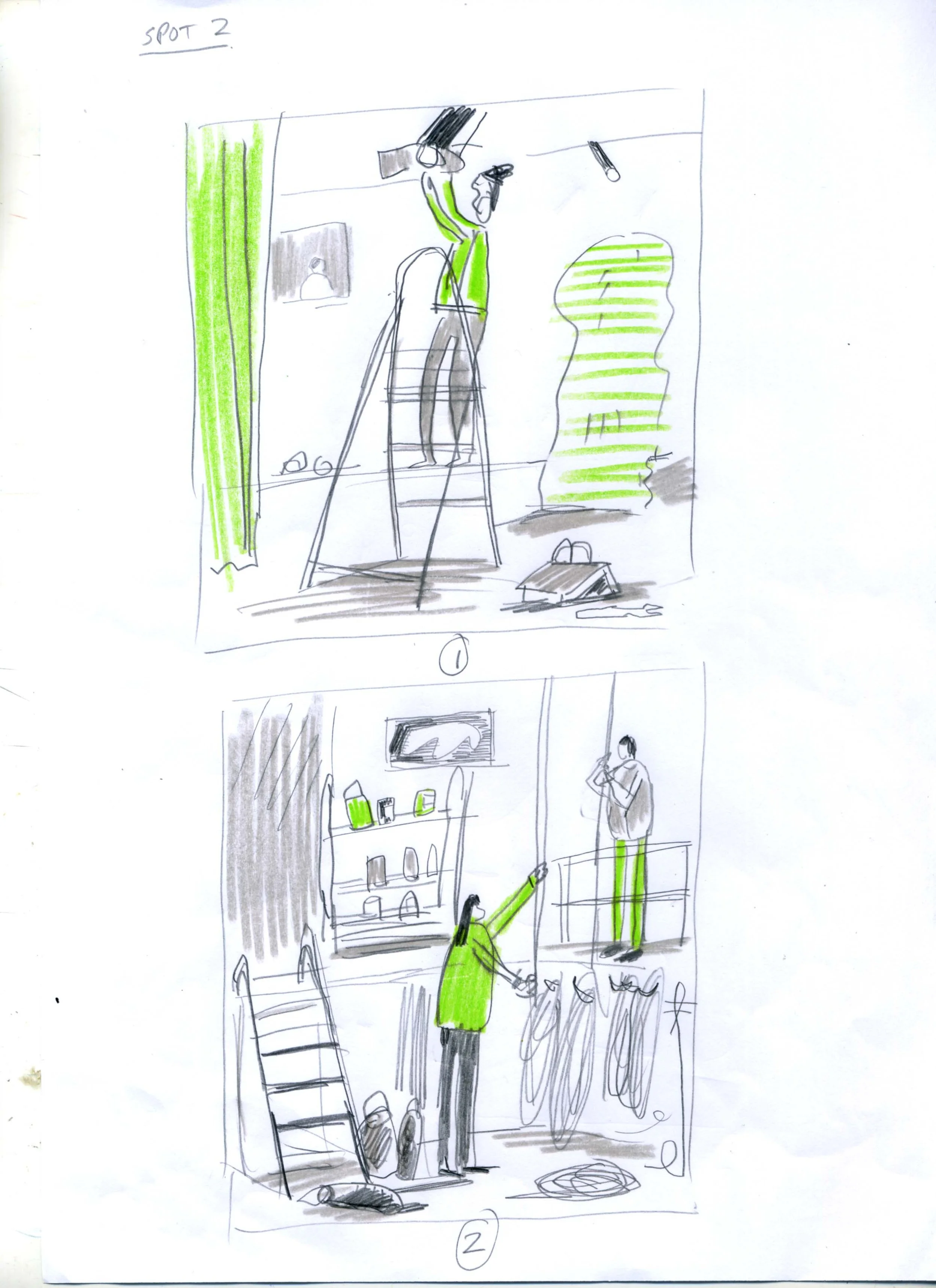
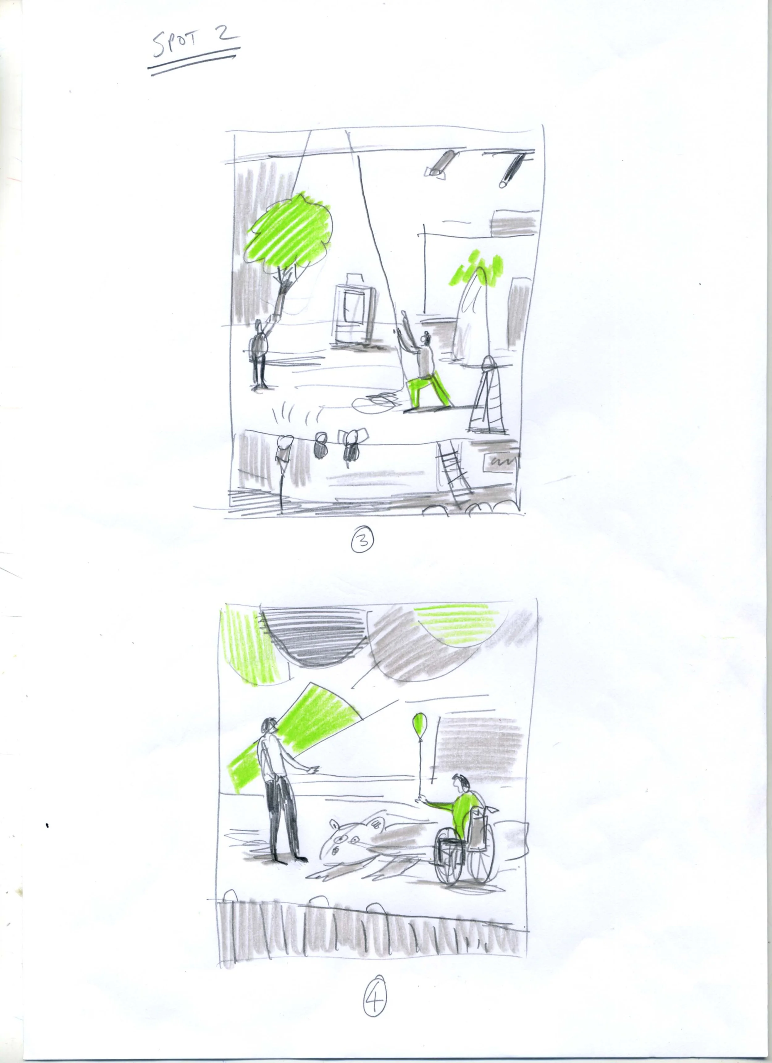
Spot Illustration (2) - Sketch ideas and final art
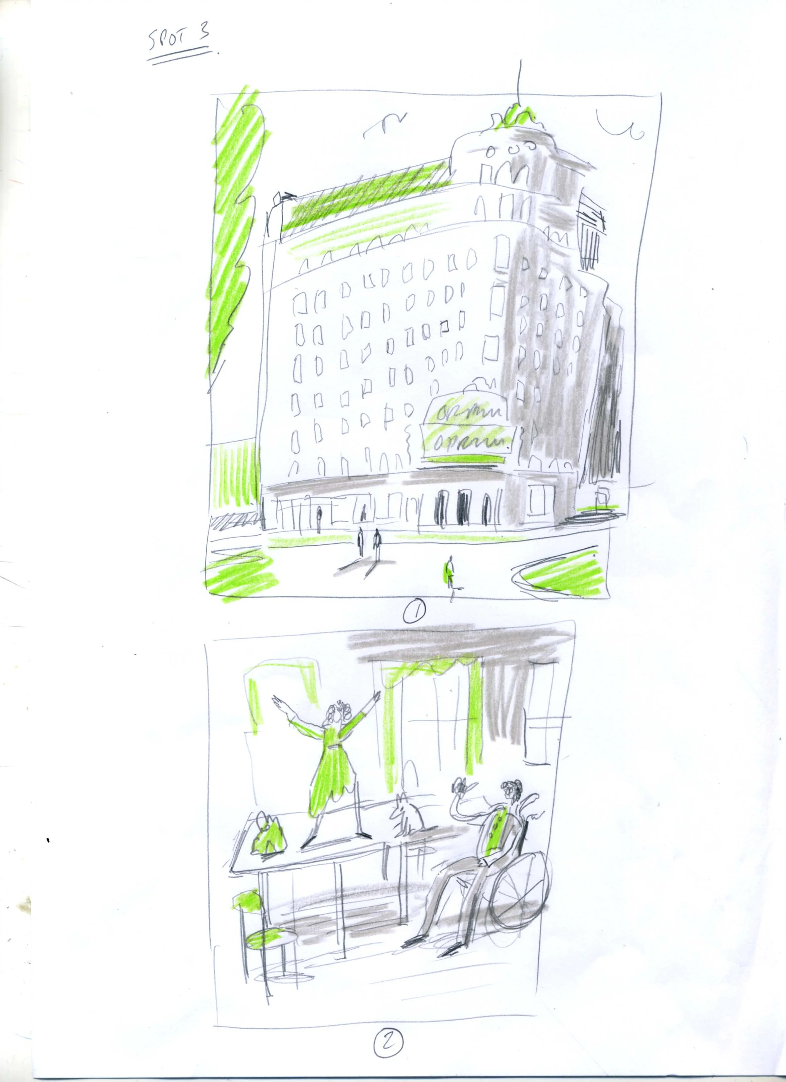
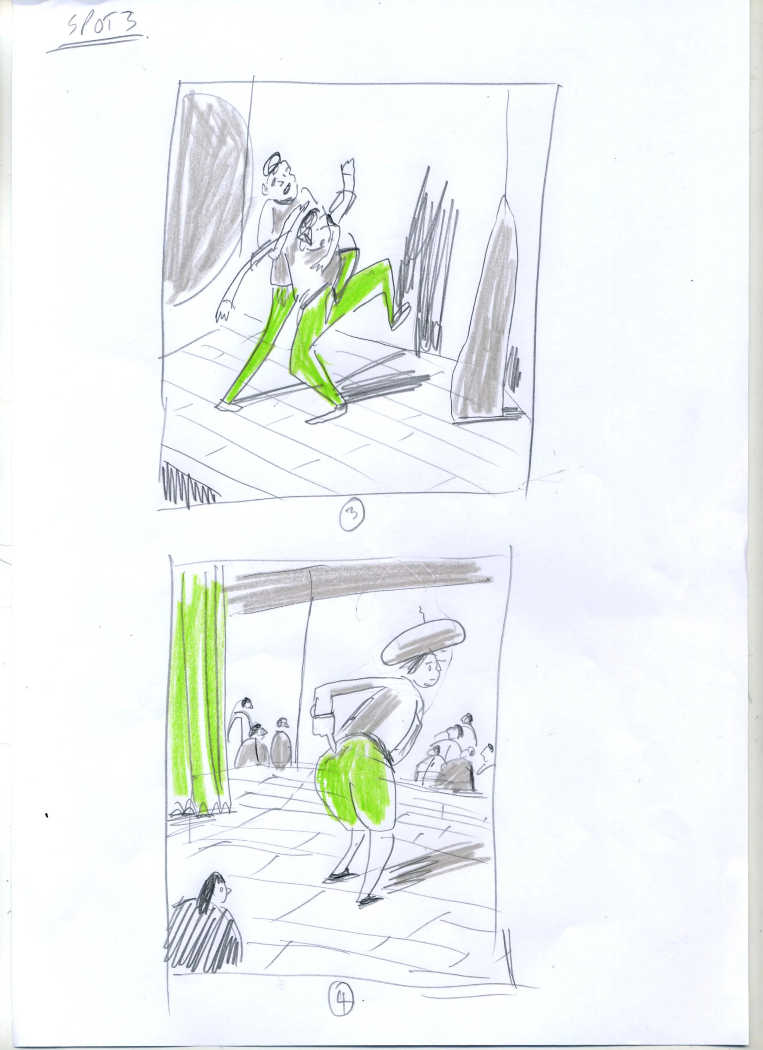
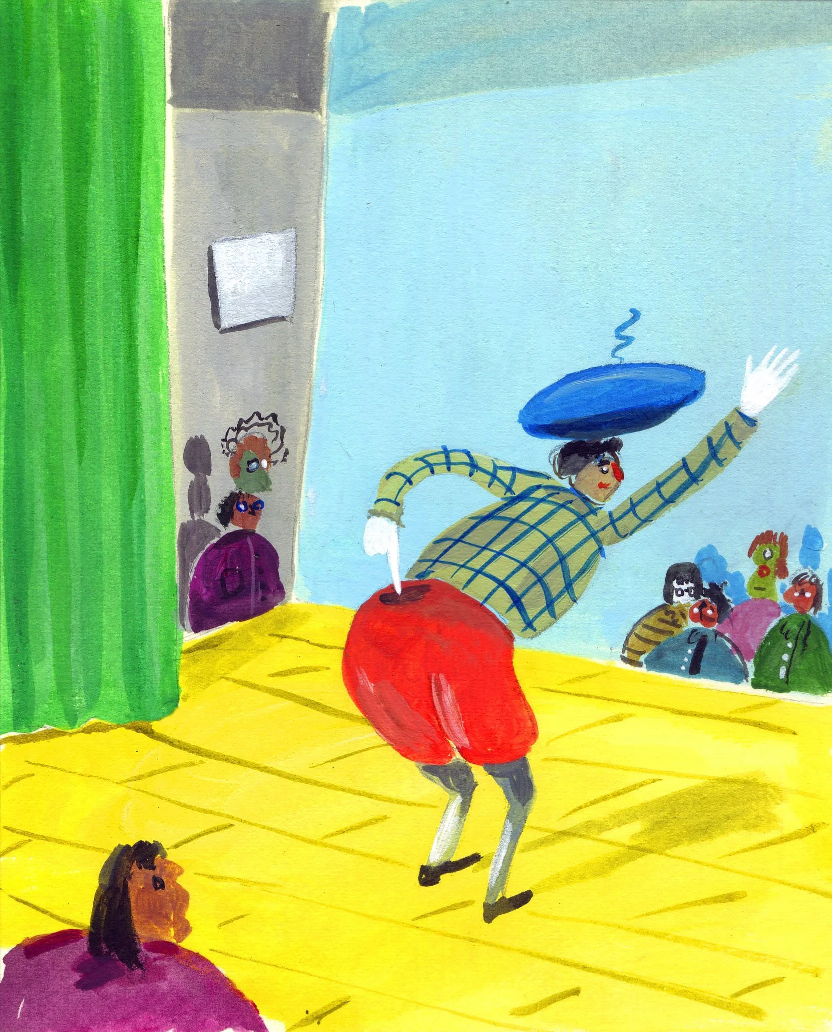
Spot Illustration (3) - Sketch ideas and final art
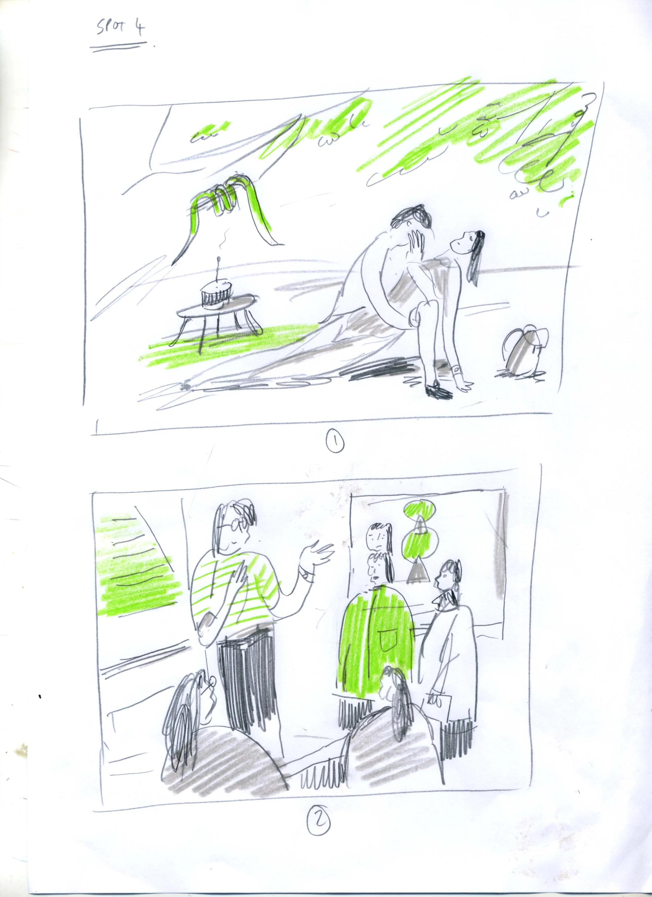
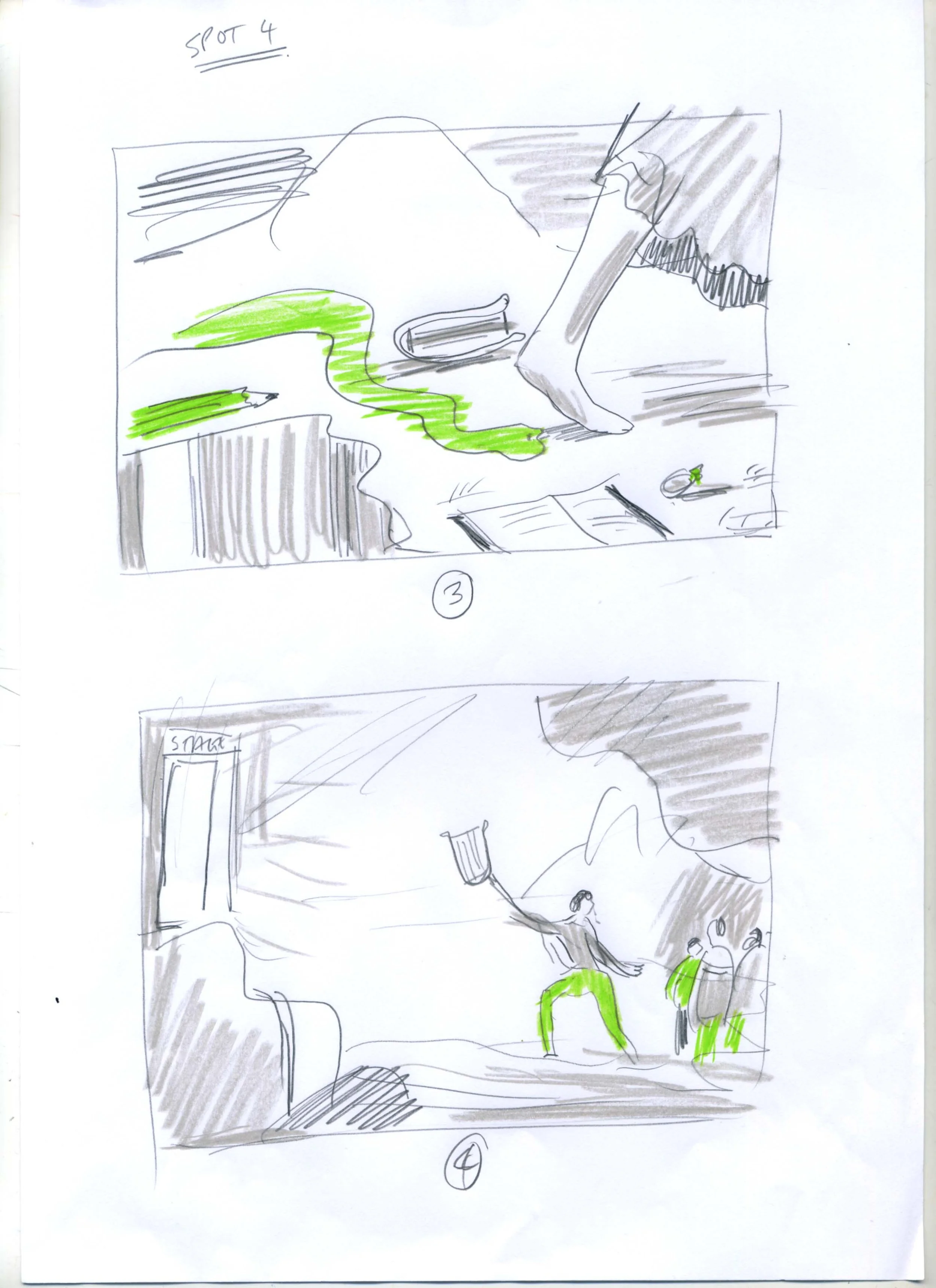
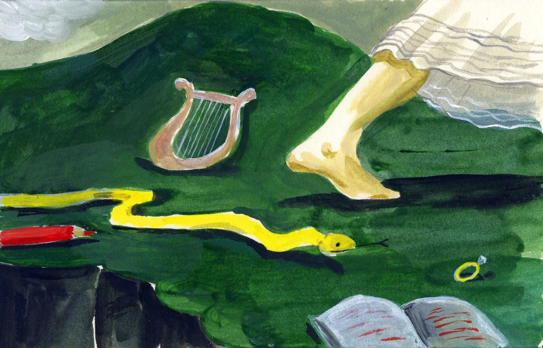
Spot Illustration (4) - Sketch ideas and final art
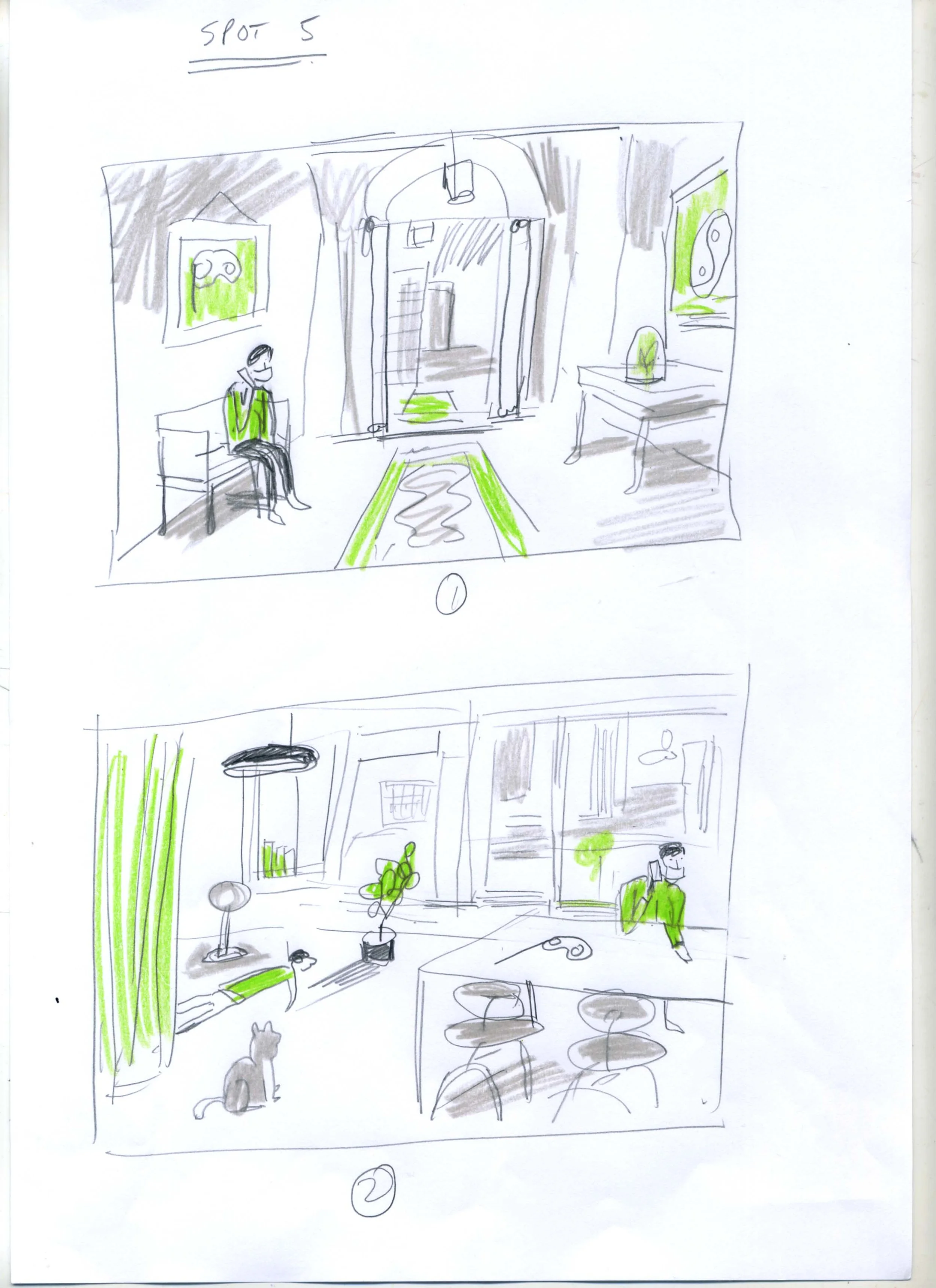
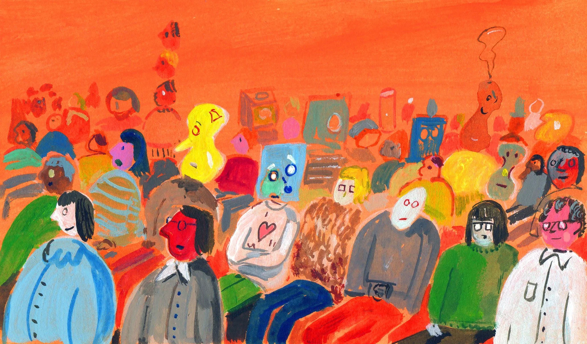
Spot Illustration (5) - Sketch ideas and final art
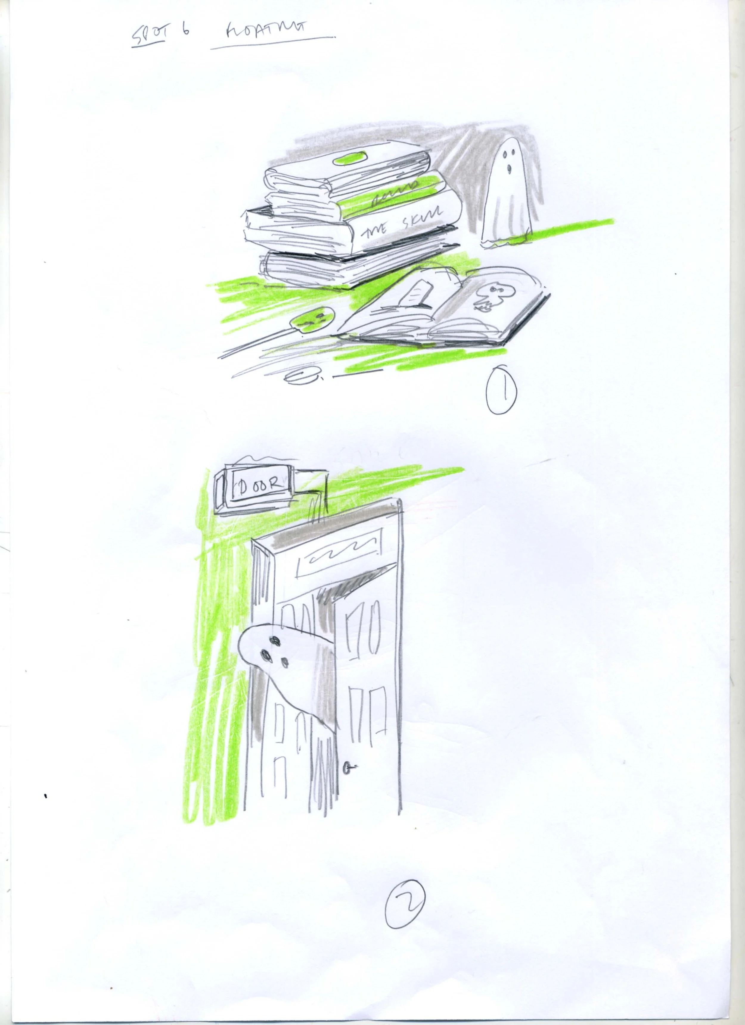
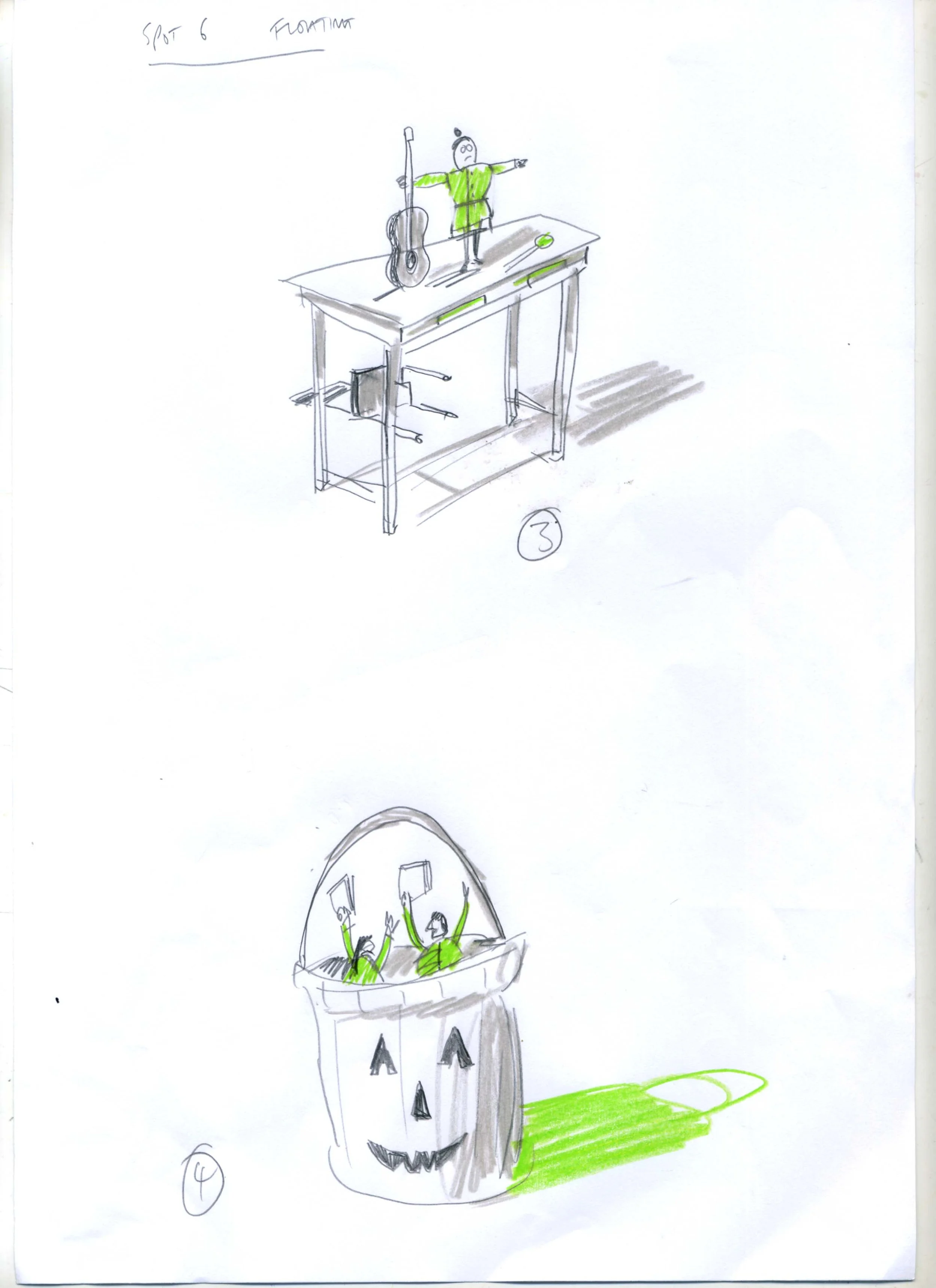
Spot Illustration (6) - Sketch ideas and final art
The 2026 Verdict: Rob’s Your Man
For commissioners of illustration seeking the "human touch," the choice is clear. If you want an illustrator who bridges high-level ideas with a beautiful, hand-drawn illustration style, Rob’s your man.
As the industry moves away from the "uncanny valley" of computer-made art, Rob’s work proves that the best stories are told with a human hand, a bit of wonky charm, and an unfettered conceptual illustration.
Robert Nicol Portfolio — www.dutchuncle.co.uk/robert-nicol