Illustrated Coffee Packaging Design: From Coffee Bag to Brand Obsession
Coffee packaging didn’t always look like this!
In the 90’s, coffee was a characterless, dusty glass jar in my mums cupboard or the gold lid of Nescafé Gold at my grandmas, suggesting middle class sophistication. At school, the lingering smell of coffee drifted from the teachers room down the squeaky corridors of upper school. Certainly not freshly ground beans from some far away continent evoking exotic climates. Coffee was brown with a dash of milk and 2 sugars and it served a function. A builders coffee.
Nowadays, for better, it sits proudly on specialty coffee counters and shelves like a beautiful print edition.
Over the years, illustration has moved from the margins of coffee branding to it’s centre spotlight.
Packaging platforms such as The Dieline and Packaging of the World regularly feature coffee projects where the artwork leads the story. Instagram accounts like BP&O (Branding, Packaging & Opinion) treat coffee bags as graphic case studies.
From our perspective across London, New York, and Tokyo, we’re seeing the global shifts in coffee packaging.
In a saturated market, packaging has to work harder.
Craft beer embraced illustration early and coffee followed quickly behind. Coffee packaging designs now carry wolves, botanicals, abstract compositions, eccentric characters and flashes of psychedelia.
There’s a lot of variation and its gorgeous (See below for some examples)
But has coffee packaging reached its peak? and if so its exciting to think where’s next?
The coffee bag still remains a compact canvas to experiment on. In 2026, limited editions are inviting new artists to wow the customer with cool visuals. Print finishes have evolved and packaging design continues to step up to the challenge.
Maybe we’ll see a return to quiet design or sustainable packaging leading the way, like the new Allpress redesign.
That once-dusty Nescafe jar in the back of the cupboard is now an unapologetic coffee bag left out on the kitchen countertop as a statement of good taste and conversation.
At a Glance: The Evolution of Coffee Branding
From Function to Fashion: Coffee packaging has shifted from generic jars to curated "design objects" that define kitchen aesthetics.
The Illustrator’s Role: Brands are moving away from minimalist typography toward surrealism, folk art, and high-concept storytelling to stand out in a saturated market.
Key Trend for 2026: We are seeing a move toward "Quiet Design" and sustainable, compostable packaging (e.g., Allpress) as the next frontier after psychedelic maximalism.
Examples of recent illustrated coffee branding that’s catching our eye…
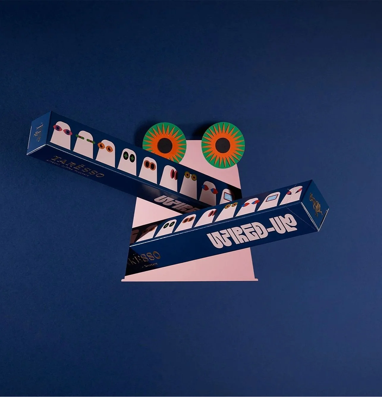
Narrative Illustration in Coffee Packaging: Taresso by Luminous Design Group
Design by @luminousdesigngroup
The full Taresso packaging suite — from the illustrated Single Origin series and capsule designs to the Ritual filter coffee and Cold Brew bottle was conceived, designed, and illustrated by Athens-based @luminousdesigngroup, who built a richly storytelling visual world for @taresso_coffee drawing on multicultural portraiture, hourglass mechanics, and boldly distorted graphic elements.
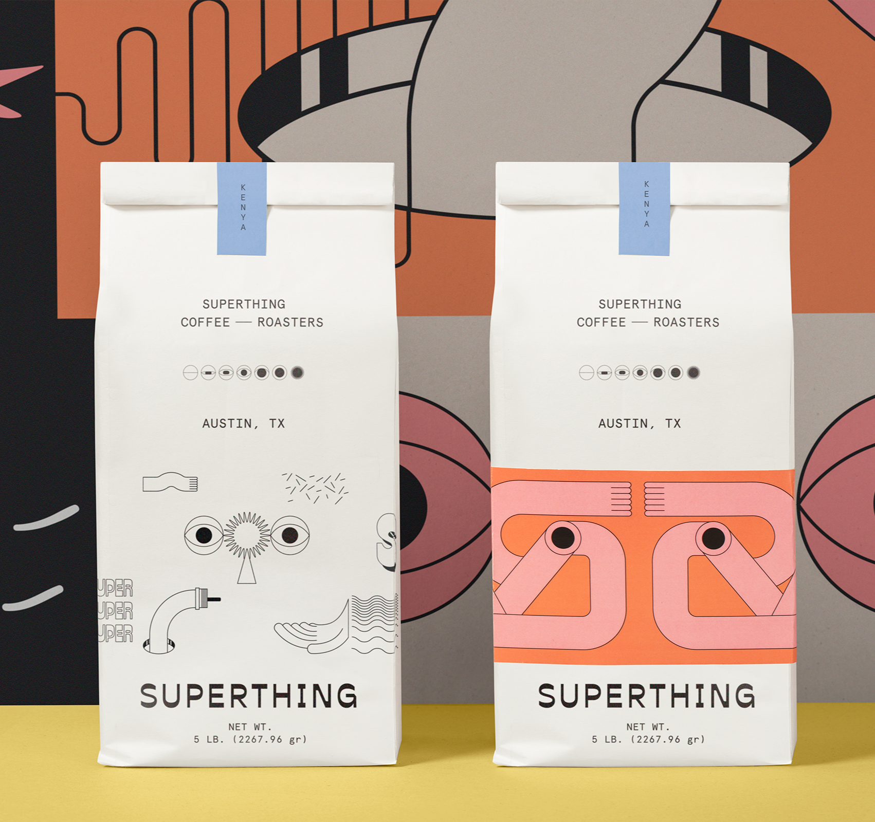
Surrealist Branding Trends: Superthing Coffee by Futura
The surrealist branding and packaging for @superthingcoffee was created by Mexico City-based @byfutura, who built a "visual universe of exaggerations" — cycloptic creatures, abstract portals, and a dynamic logo — feeling like Salvador Dalí designing for the Atari 2600.
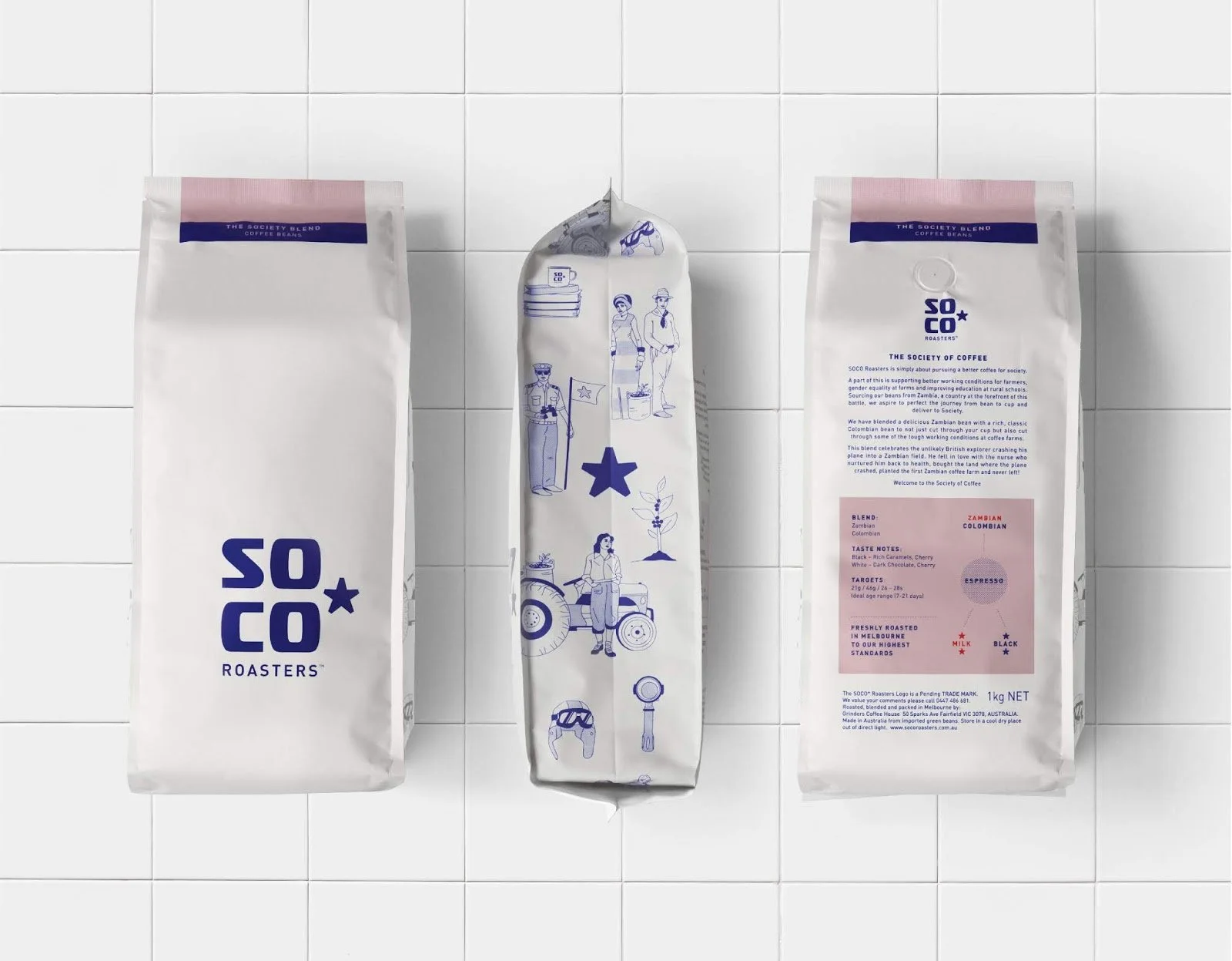
SOCO Coffee Roasters
The SOCO Coffee Roasters packaging was designed by @creativeplatformsyd who built the brand around the concept of a "society of coffee," pairing a bold star logo with hand-crafted illustrations rooted in Zambian folklore to reflect the brand's commitment to supporting local coffee producers.
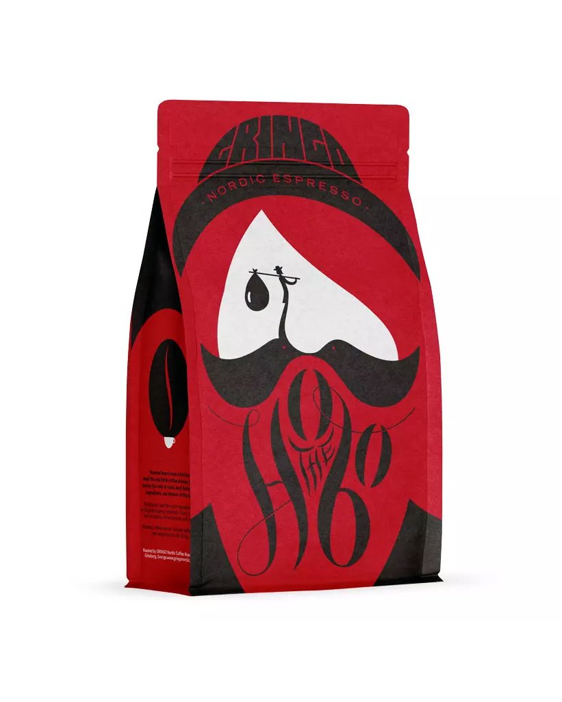
Negative Space coffee packaging for Gringo Nordic Hobo blend
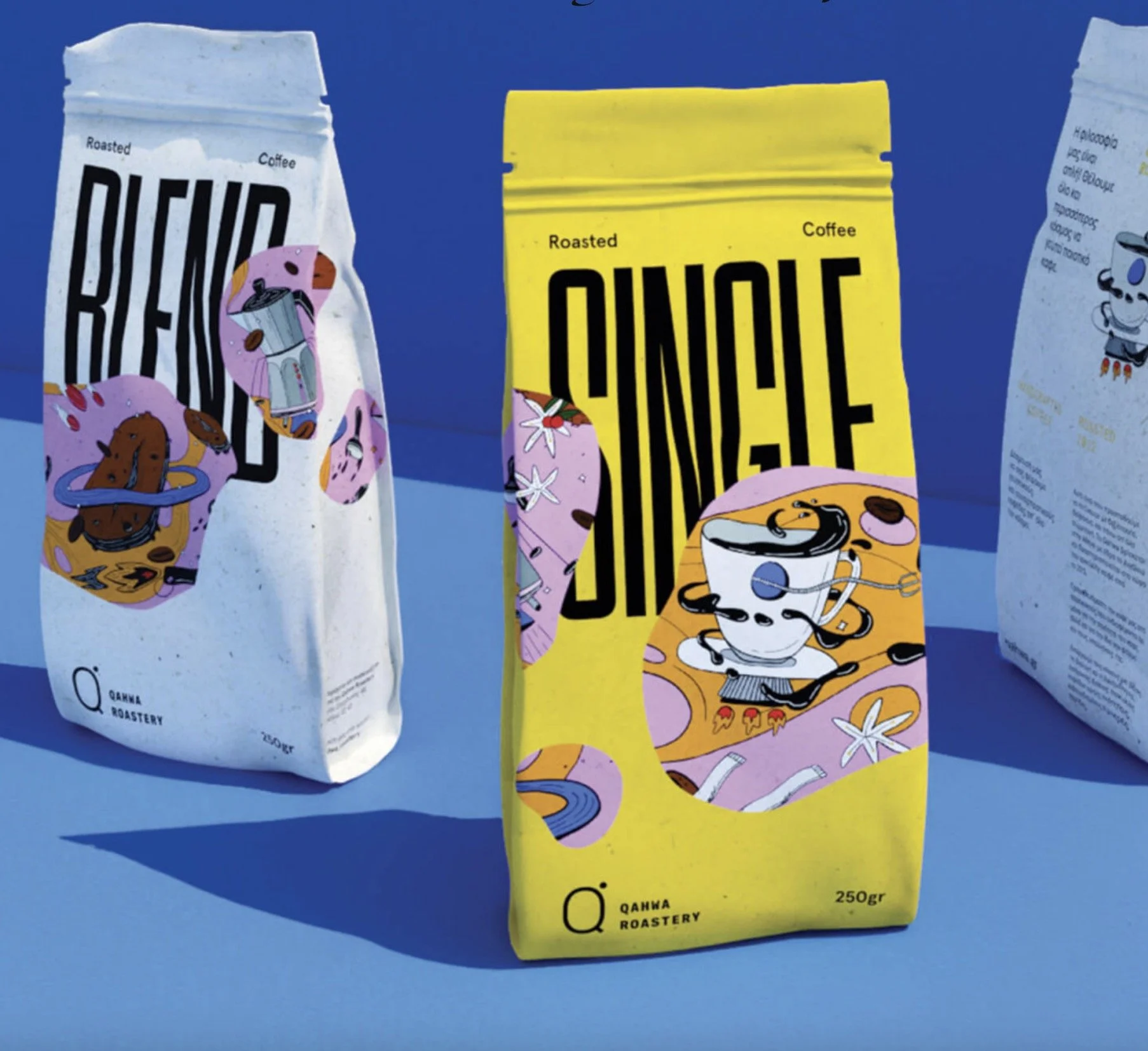
Vibrant Qahwa Roastery packaging
Design by @thehowdyfamily
The Qahwa Roastery packaging design and hand-crafted illustrations were created by Athens-based @thehowdyfamily, who built a vibrant "tasteful universe" using bold typography, eye-catching details, and illustrations of everyday coffee utensils rendered in a striking palette of pink, yellow, blue, and white.
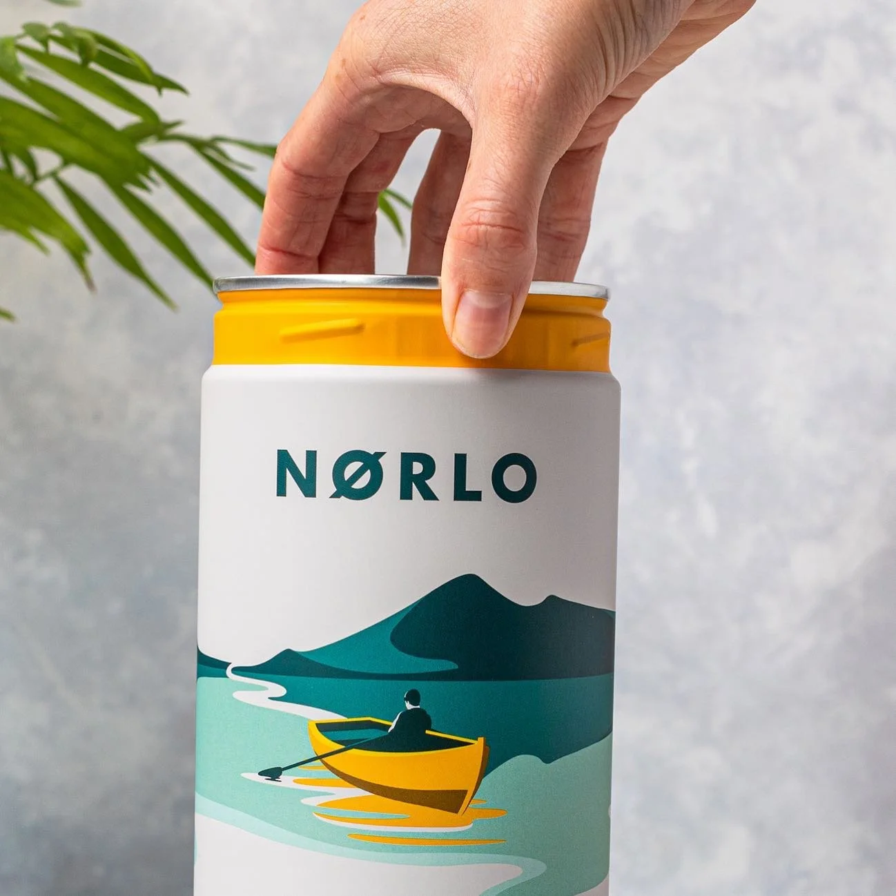
Scandinavian minimalist coffee tin design for Nørlo Coffee
Designed by @designhappyuk
The Nørlo Coffee brand creation, illustration, and packaging design was handled by London-based agency @designhappyuk, who built the brand from the ground up using Scandinavian minimalism, featuring bespoke Nordic landscape illustrations, a signature golden yellow accent, and cylindrical tins whose wraparound panoramic artwork tessellates seamlessly across all three product variants.
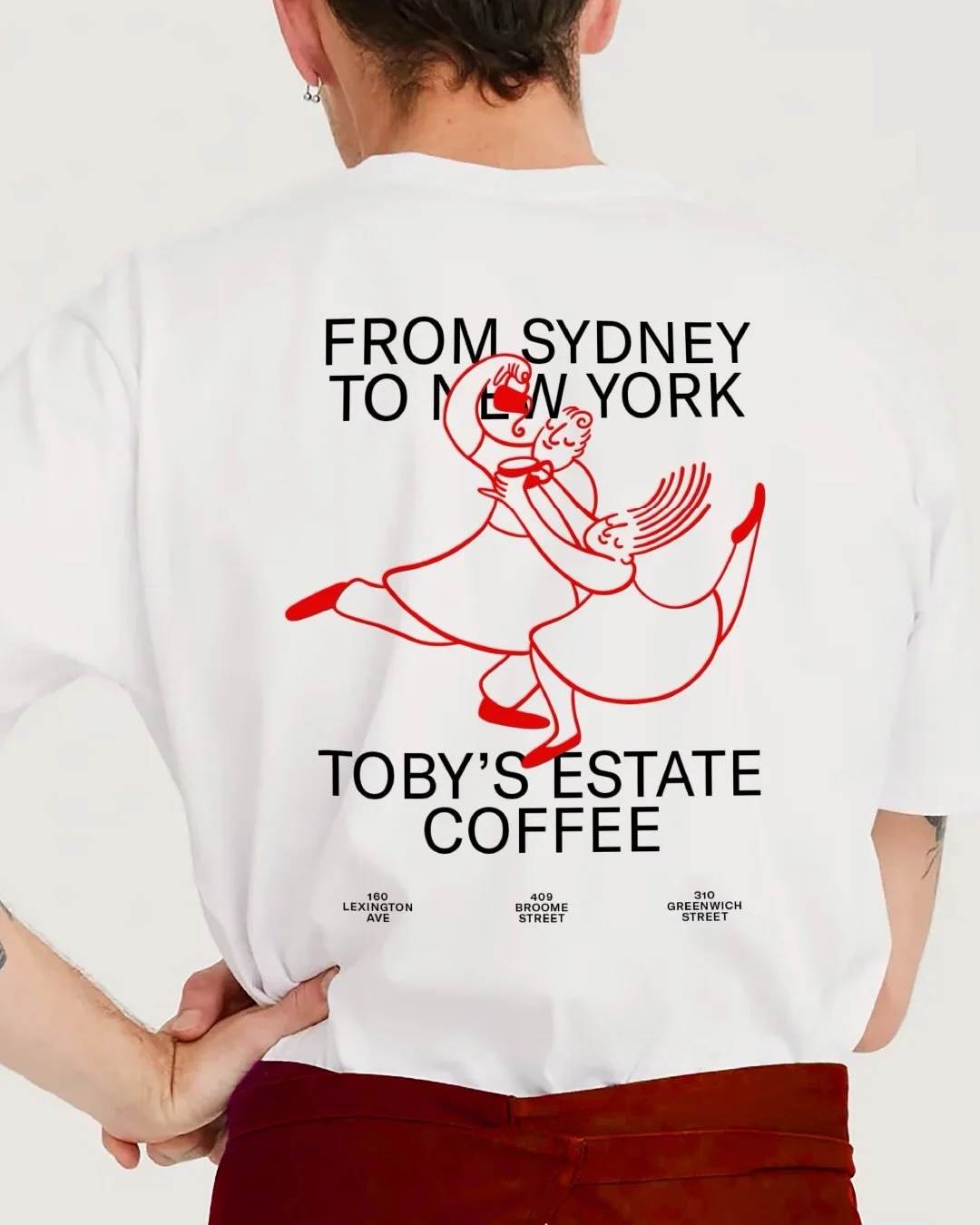
TOBY’S COFFEE
Illustrated by Debora Szpilman
In close collaboration with Pinnacle Group, @kingandpartners orchestrated a bold reintroduction of Toby's Estate — reimagining everything from market positioning to brand identity, crafting a presence that honors its roots while carving out a distinctly ownable place in U.S. coffee culture.
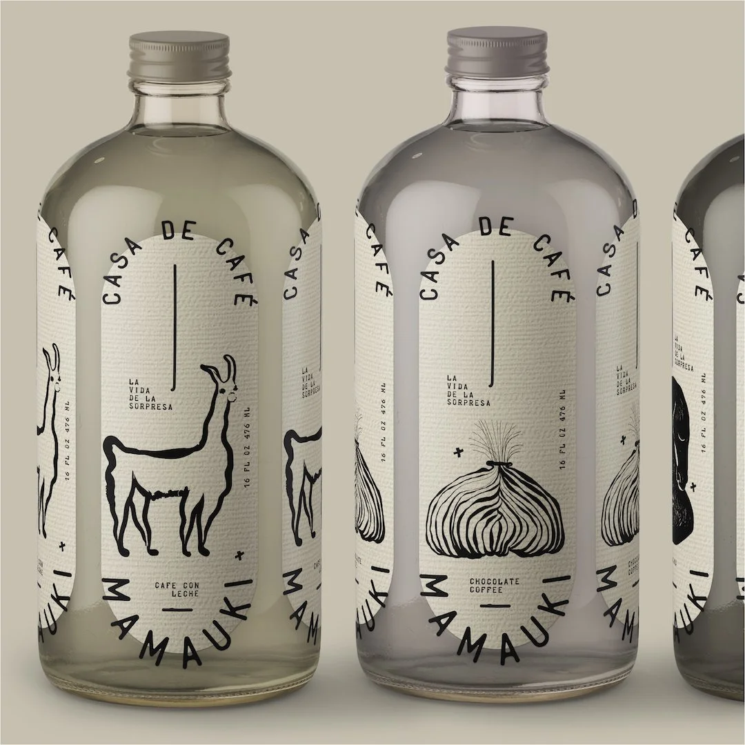
MAMAUKI Coffee
Mamauki's striking packaging was designed by @ajamariejohnson, featuring black and white illustrations, pill-shaped labels, and wrapped typography inspired by vintage Western motifs and a caravan expedition through the mountains of Peru.
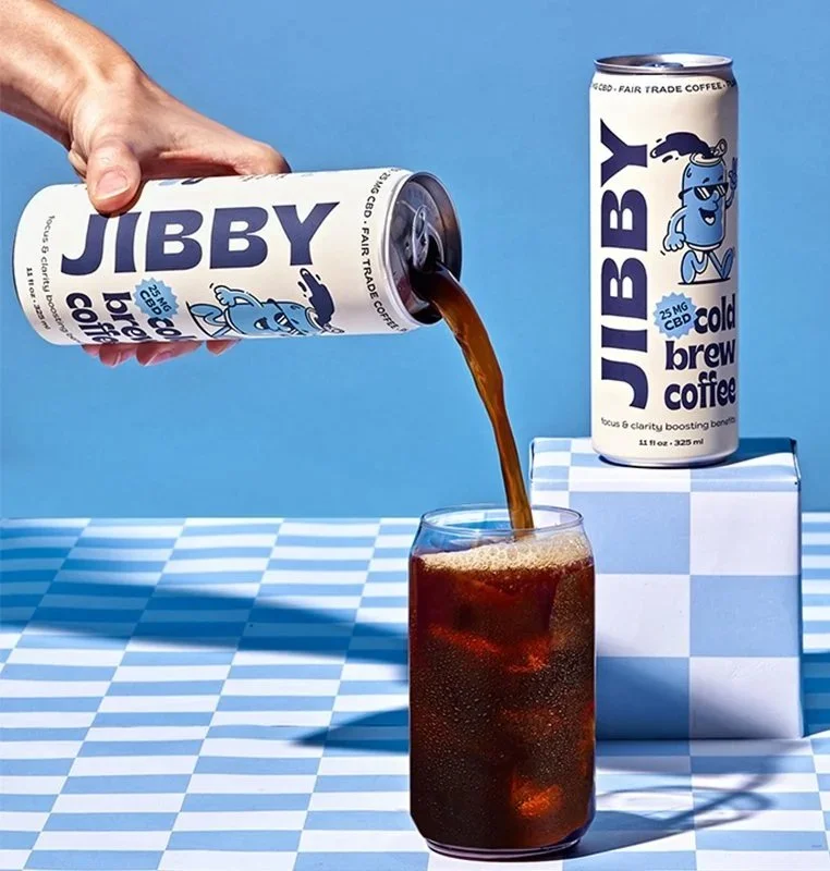
JIBBY COFFEE
Designed by @wonderkindco
Wonderkind's packaging design for JIBBY Coffee is nostalgic yet refreshing, pairing a creamy background and bold navy typography with playful vintage illustrations to help the brand stand out on shelf.
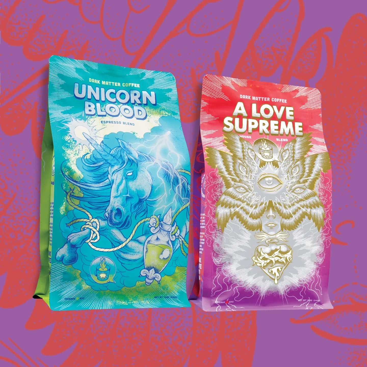
DARK MATTER COFFEE
Illustrated by @raulurias_studio
Dark Matter Coffee's punk, occult-charged packaging for blends like Unicorn Blood, A Love Supreme, Starry Eyes, and Machete is illustrated by Mexico City-based Raul Urias, art-directed by Jim Zimmer of Chicago studio Zmmr.
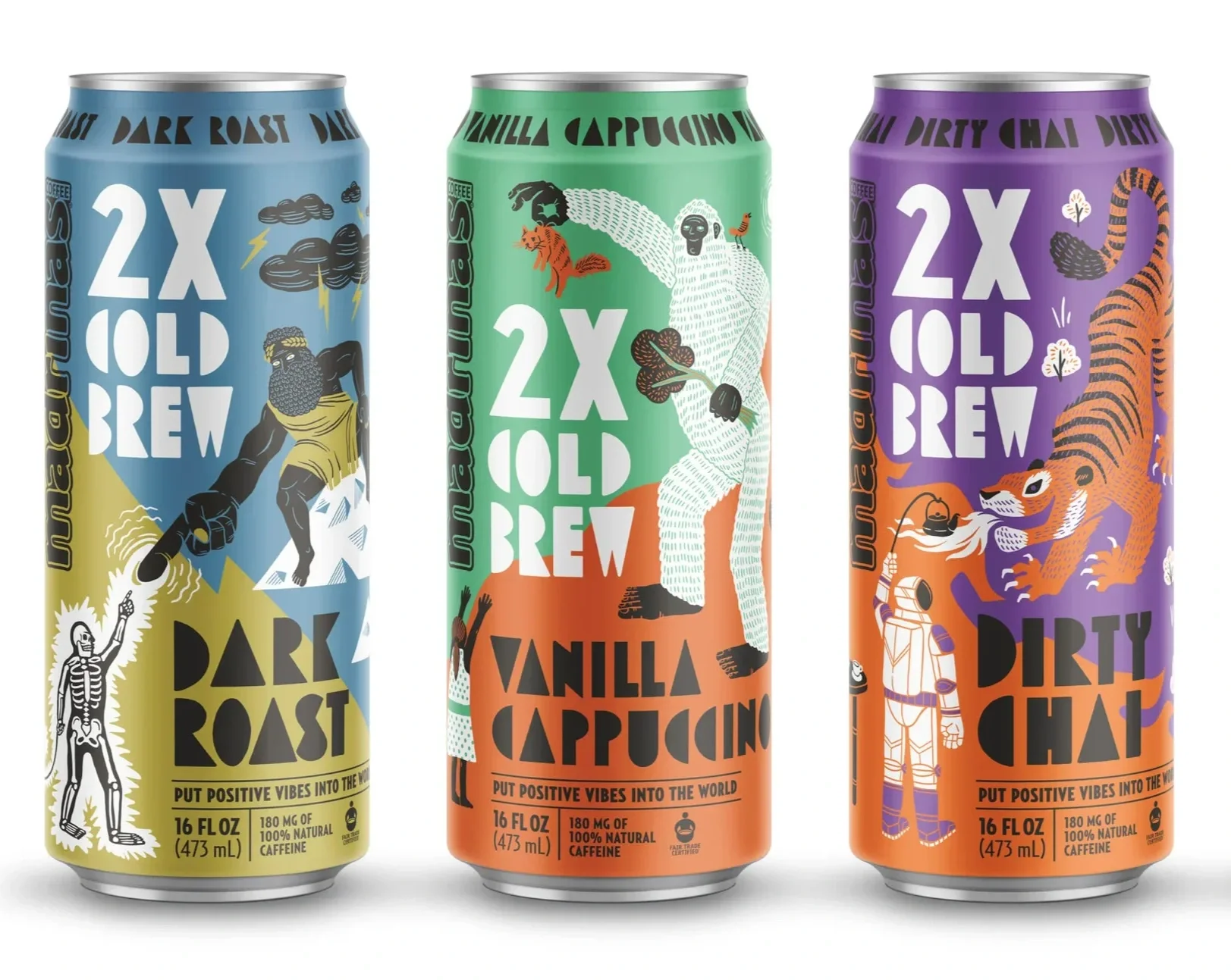
MADRINAS Coffee
Design by @moxiesozo
The Madrinas Coffee packaging was designed by Moxie Sozo, a branding and design agency based in Boulder, Colorado. Illustrated by Taylor Holloway.
INTERMISSION London
Illustrated by Tomi Um
Intermission London's packaging and identity was designed by Fieldwork Facility with illustrations by Tomi Um
Design by @fieldworkfacility
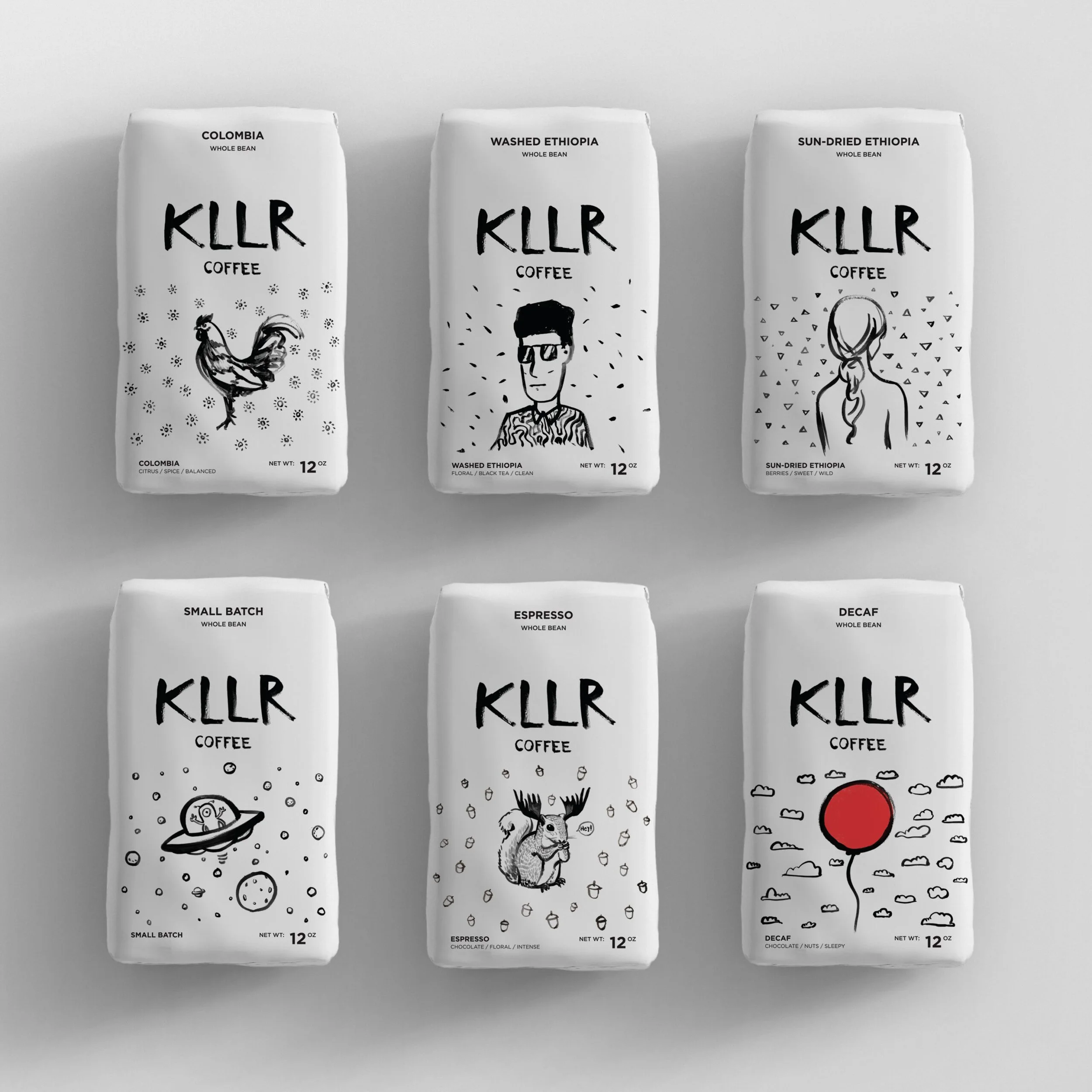
KLLR Coffee, Oklahoma
Illustrated by Koon Vega
KLLR Coffee's distinctive silver-and-black packaging was designed and illustrated by local Oklahoma City artist Koon Vega of Creative Vega.
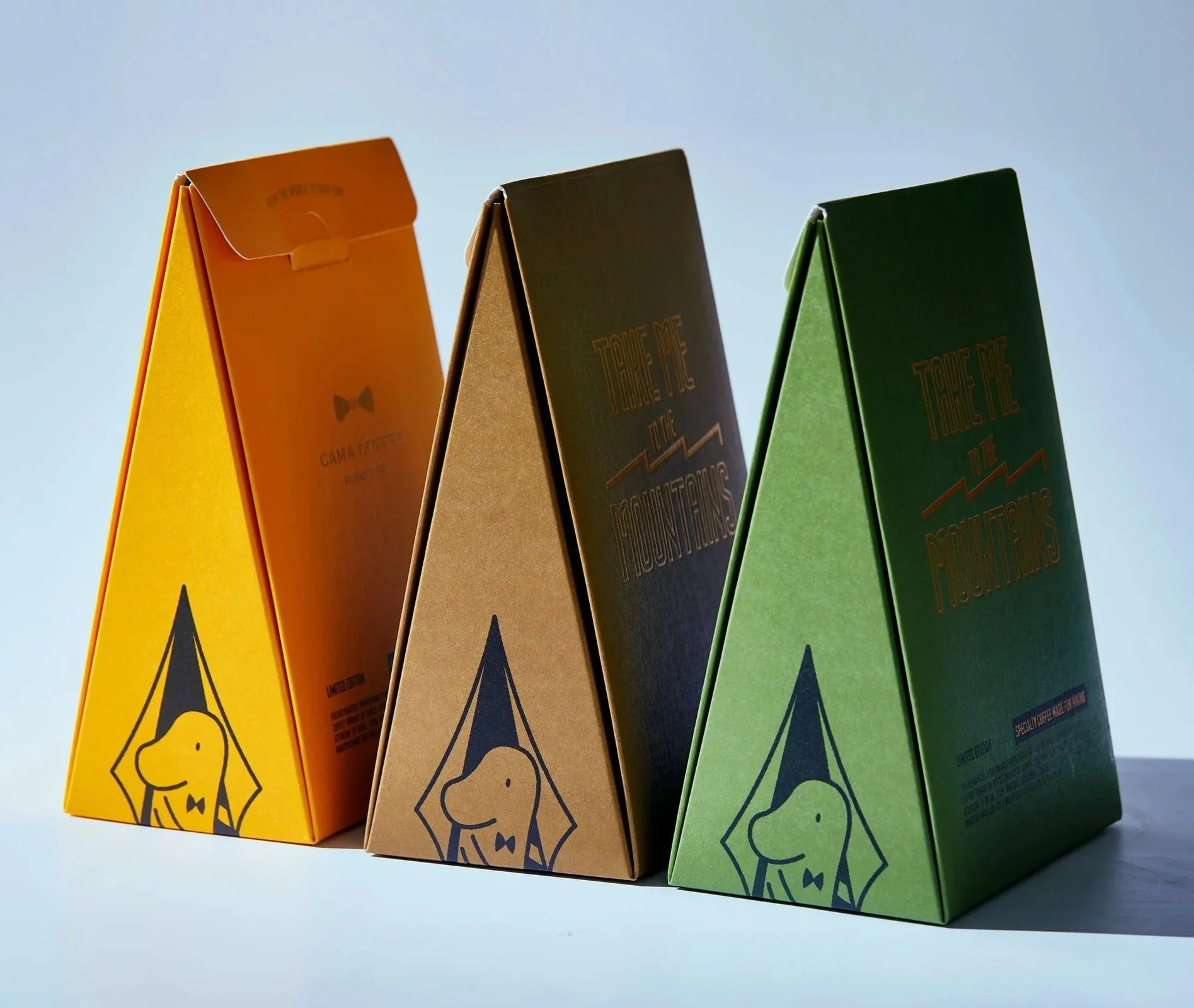
CAMA Coffee
Designed by @lunghao.chiang
Taipei-based designer Lung-Hao Chiang (姜龍豪) has designed and illustrated cama café's packaging across multiple collections, serving as art director and handling both the branding and illustration work with a penchant for witty but eye-catching branding.
Cama Cafe @camaxinyi
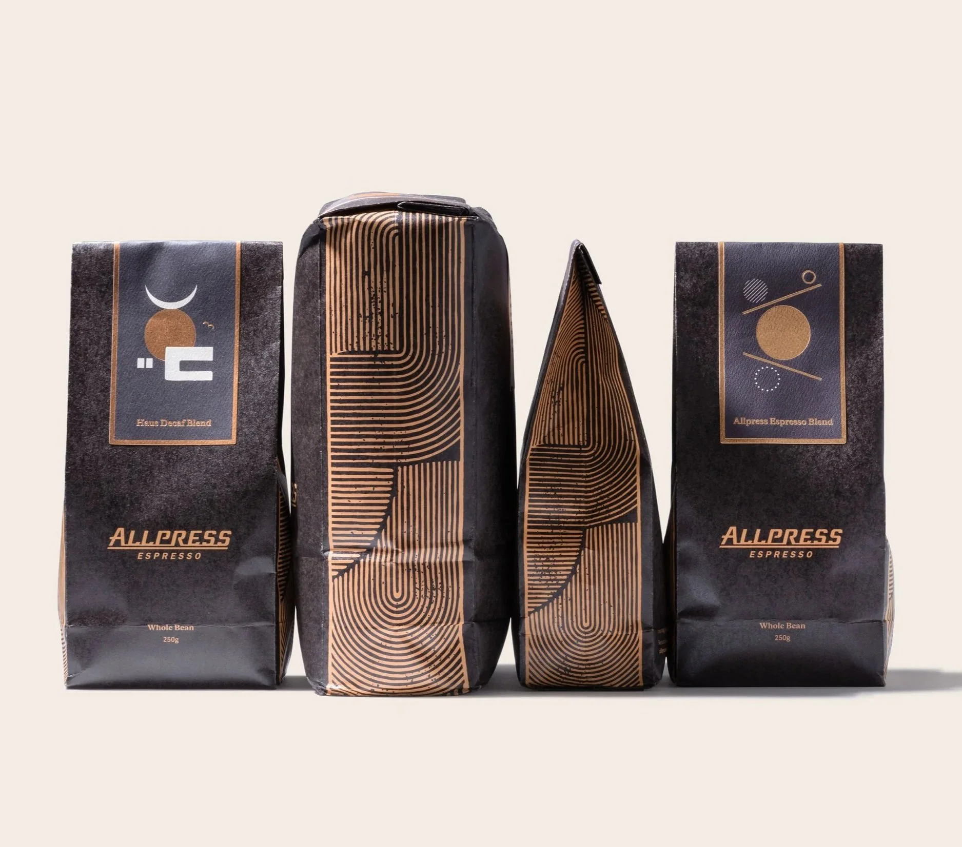
The Future of Sustainable Packaging: Allpress Espresso’s Compostable Design
Designed by Studio A-Z
Allpress Espresso's compostable sustainable coffee packaging, designed by Studio A-Z, was recognised at the Designers Institute of New Zealand's Best Design Awards in the Packaging category.
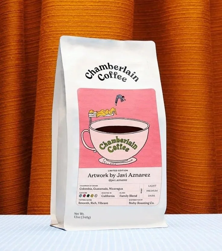
Chamberlain Coffee
Illustrated by Javi Aznarez
Chamberlain Coffee is a Gen Z-targeted coffee brand founded by YouTube personality Emma Chamberlain.
Known for its playful illustrated packaging and its expansion from direct-to-consumer organic coffee into matcha, ready-to-drink lattes, and over 8,500 retail locations.
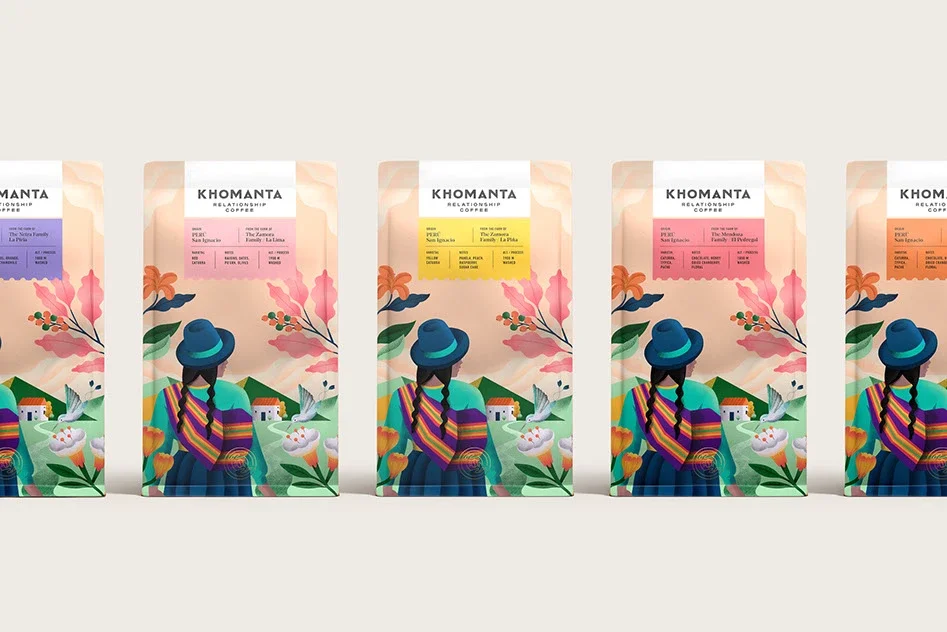
KHOMANTA Coffee
Khomanta Coffee's vibrant, culturally rich packaging — featuring hummingbirds, Andean flowers, and the traditional manta blanket — was designed and illustrated by Leeds-based, Lima-rooted graphic designer Alejandro Gavancho alejandrogavancho.com
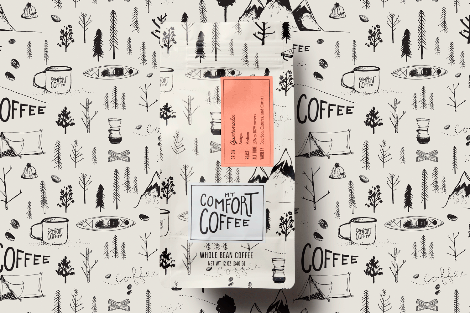
Mt. Comfort Coffee
The Mt. Comfort Coffee packaging was designed and illustrated by Nicole LaFave of @designwomb, an award-winning San Francisco-based branding and packaging agency whose hand-crafted branding, logo, patterns, and full packaging line earned a American Packaging Design Award from Graphic Design USA.
Looking to elevate your brand with world-class illustration? At Dutch Uncle, we represent the artists shaping the visual landscape of modern packaging. From the minimalist precision of Noma Bar to the spatial storytelling of Jisu Choi, we help brands turn products into design icons.
View our full Illustration Roster here →
Article written by Dan Chrichlow @danchrichlow