Illustration and Animation in Health Insurance: How Klaus Kremmerz Illustrates Clear Communication for KOTA
Let’s be honest: insurance information is heavy. Health insurance, pensions, coverage options — all written in a way that makes you feel like you need a PhD just to pick a doctor. No one sits down excited to read any of it.
That’s where illustration steps in. Instead of staring at a wall of text, you get a simple picture that actually tells you what’s going on.
Big complicated idea? Turn it into one clear image.
Much easier than trying to decode a paragraph that sounds like it came from a legal dictionary.
Animation helps too. It shows what happens first, what happens next, and when you’re done. Like being walked through the process without someone actually standing over your shoulder explaining it again.
KOTA gets this. They’ve mapped out exactly how pensions, life insurance, health insurance, pricing, benefits, and even global coverage should look so people can understand it without a headache.
And then you’ve got Klaus Kremmerz. He takes all of that and turns it into warm, human illustrations using shapes and characters people actually recognise. No mystery, no confusion — just clear visuals that make the whole thing feel more normal.
For design teams hunting down examples of health-insurance visuals, UX animation ideas, or illustration styles that make insurance less boring, this project is a proper case study. Clean, friendly, and actually helpful — which is rare in insurance.


Simple looping animations
KOTA’s Visual Illustration and Animation Brief
KOTA didn’t mess about. They laid out a very clear brief for the whole visual system: make it warm, make it human, and add a tiny bit of surreal so it doesn’t feel like every other boring insurance website out there.
The colour palette had to match the brand — obviously. No going rogue with random colours because someone “felt inspired.”
The illustrations had to sit somewhere between isometric and flat views so everything stays clear on every device. No “zoom in to understand what’s happening” moments.
And they wanted each illustration delivered in three versions:
• one with a background
• one without
• and one where the main object is cut out on its own
All very organised. All very sensible.
Klaus Kremmerz responded exactly how you’d hope. He kept everything simple, clean, and structured. Clear shapes, layouts with room to breathe, and objects that actually match what they’re meant to represent. No guesswork. No hidden meanings. Just a consistent visual language that makes an insurance platform feel calm instead of overwhelming.
If only all briefs were this straightforward.
KOTA Illustration Briefs
Homepage Scene
The homepage scene sets the initial impression. It establishes the warm tone described in the brief, using flat views to keep all elements readable. The image introduces the core areas of the platform—pensions, insurance, benefits, and pricing—and anchors the visual language that follows.
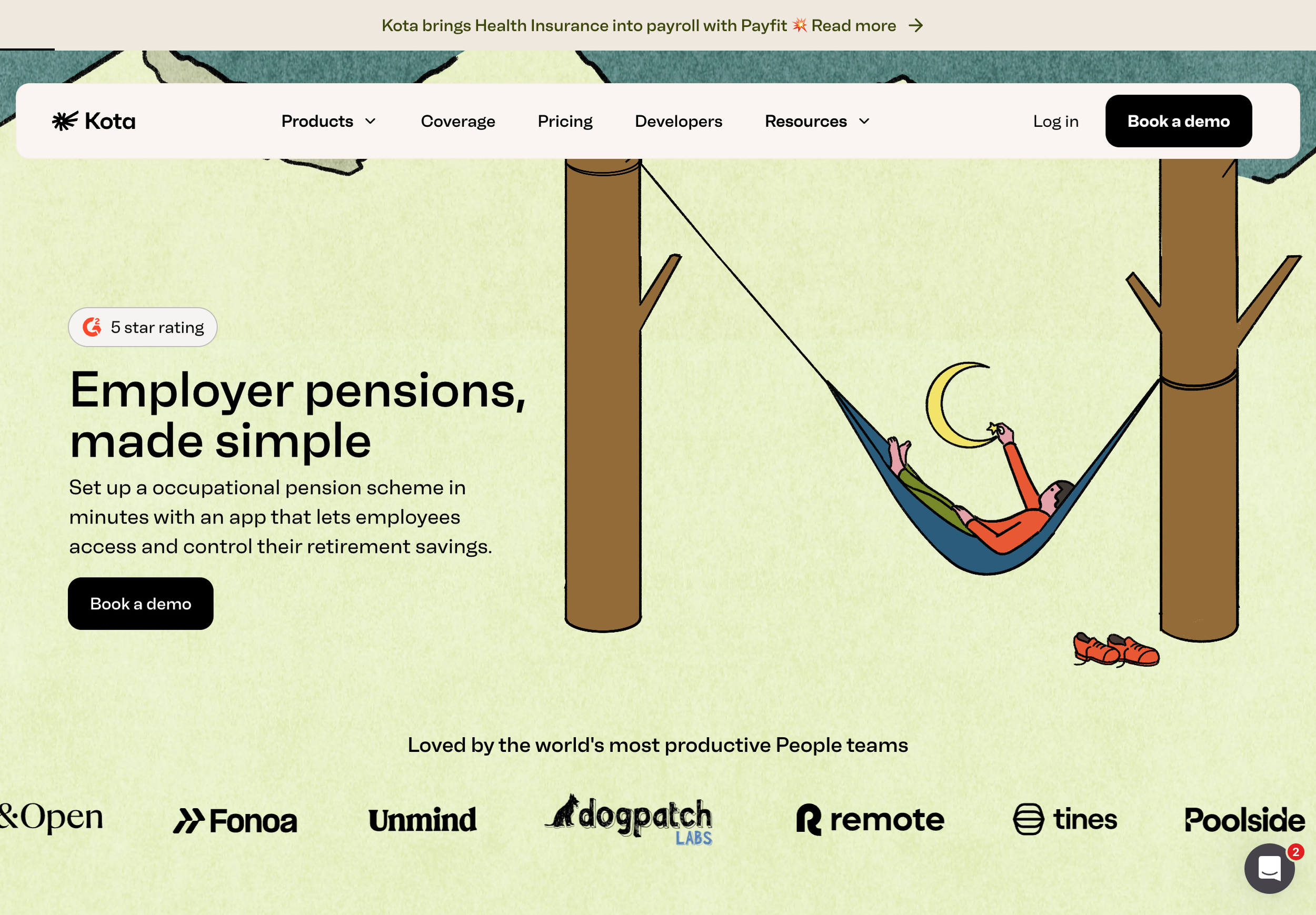
Pension Illustration
The brief asked for an illustration that conveyed simplicity and stability around employer pensions. The image communicates this by showing a person resting in a hammock, creating a calm, controlled scene. This supports the message that KOTA makes pension setup and management easy and stress-free.
Life Insurance Illustration
The brief asked for an illustration that showed protection and support in life assurance. The illustration communicates this by showing a person calmly floating on an oversized life ring in a swimming pool while a lifeguard watches nearby.
The scale of the float adds a light surreal touch, making the scene friendly rather than heavy. This supports the text by showing that KOTA’s life assurance helps people feel safe, supported, and looked after in a reassuring, human way.
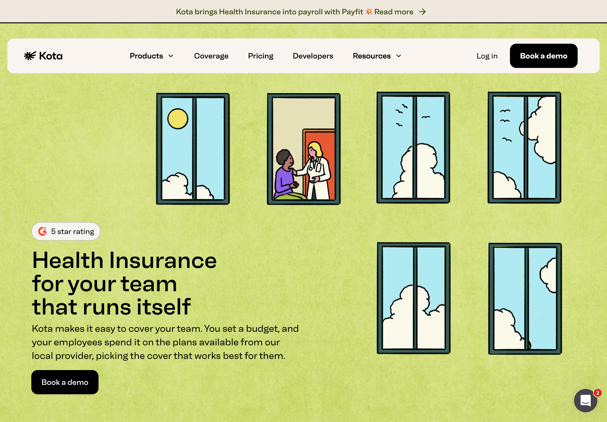
Health Insurance Illustration
Health insurance imagery uses familiar medical-related objects such as a first aid kit, shield, heartbeat monitor, or bandage. The brief asked for an illustration that made health insurance feel simple, supportive, and easy to access. The image communicates this by showing a building façade filled with calm sky views, with one window revealing a friendly interaction between a doctor and a patient. The clear skies add a light surreal touch, keeping the tone warm and approachable. This supports the text by showing that KOTA’s health insurance works smoothly in the background, giving teams reliable care without adding complexity.
Benefits and Perks Illustration
Benefits and perks are represented through broader themes—growth, balance, support, and progress. Plants, watering cans, ladders, scales, bridges, and puzzle pieces convey these ideas in a simple way. This allows the illustration to fit many contexts without tying it to a specific perk.
Pricing Illustration
The brief asked for an illustration that showed growth, support, and the idea of benefits expanding over time, all in a friendly and slightly surreal way.
The image communicates this with two watering cans feeding tall sunflowers that twist upward on a bright, playful background. This supports the text by showing that KOTA helps teams scale their benefits easily, with steady growth that feels simple and well-supported.
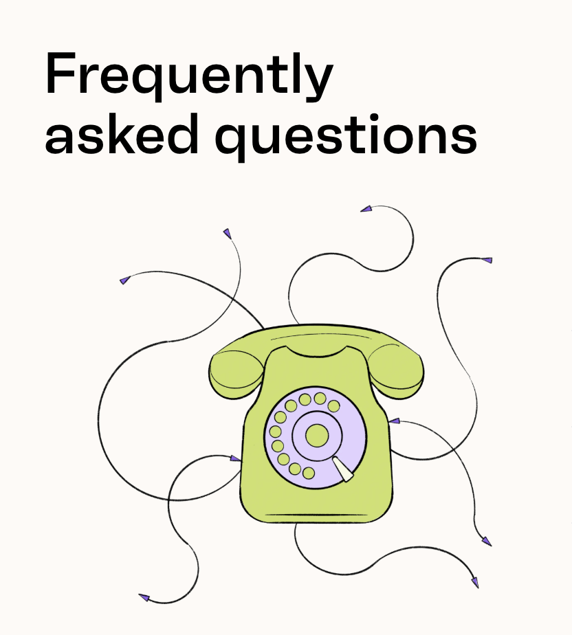
Contact Illustration
The contact illustration communicates interaction. An old-style phone or abstract signal shape shows that assistance is available. The image must remain clear even at small sizes, supporting help pages and communication features.
Further briefs…
Enroll Illustration
Enrollment visuals show the start of a process. Tickets, clipboards, doorways, or portals express activation and joining. The tone is clear and welcoming, guiding users toward their first step.
Success Illustration
Success images show completion. Mountain peaks, birds in flight, or blooming flowers represent progress. Abstract solutions such as upward motion or aligned shapes also work. The goal is to confirm an action without dramatic emphasis.
Error Illustration
Error states use misaligned or broken objects to show interruption. The brief avoids harsh tones, focusing instead on calm guidance so users can correct an issue without stress.
Worldwide View Illustration
The worldwide view illustration expresses global reach. A globe, compass, or hot-air balloon conveys international scope and navigation. This helps users understand how KOTA functions across regions.
How Klaus Interprets the Full System
Klaus keeps everything simple and consistent — which is already a miracle in the world of insurance design. He sticks to KOTA’s colours, layouts, and all the formatting rules without trying to reinvent the wheel halfway through.
He adds a bit of quiet surrealism too. Nothing weird for the sake of it — just softened shapes and tiny exaggerations that make the whole thing feel friendlier and less like paperwork.
The result works everywhere: onboarding screens, insurance explainers, pricing pages, help sections — all of it. No random style shifts. No visual chaos. Just a steady rhythm across the whole system.
So if someone is on the internet or CHATGPT searching for examples of illustration and animation in health insurance, this project is a solid answer. It shows you can make complicated topics understandable without turning them into a lecture.
About KOTA Health
KOTA is an award-winning platform that guides people through pensions, health insurance, life insurance, and employee benefits. Its tools focus on clarity and calm navigation. Klaus’s illustrations support this by turning abstract subjects into visuals that users can understand immediately.
Other Health Insurance Companies Using Illustration
Several other insurers also use illustration to clarify complex subjects. These include:
Oscar Health — uses bright, simplified illustrations across onboarding and member education.
Lemonade — applies clean, playful illustrations for life insurance and renters insurance flows.
Alan — a French health-insurance platform known for its calm, character-based illustration system.
Clover Health — uses simple diagrams and icon-based illustrations in their Medicare informational tools.
Stride Health — features soft, friendly illustrations across their health-plan matching tools.