Learning to Look Twice: The Book of Opposites illustrated by Noma Bar
Noma Bar : Book Of Opposites
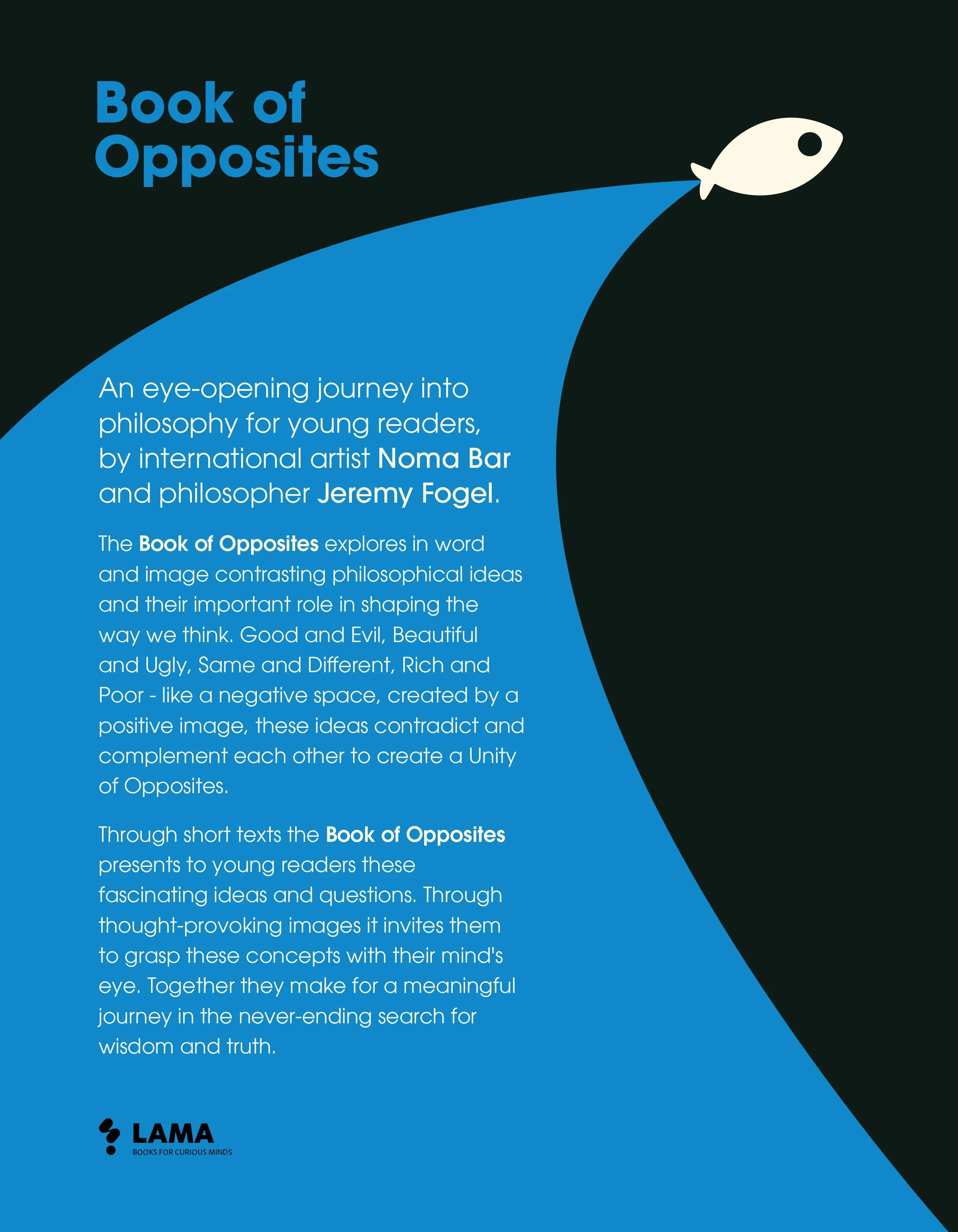
Children’s books that engage with philosophy often risk either flattening ideas or overloading them. The Book of Opposites, written by philosopher Jeremy Fogel and illustrated by Noma Bar, avoids both outcomes.
The book moves carefully, assuming that young readers are capable of sustained thought when ideas are presented with clarity and visual discipline.
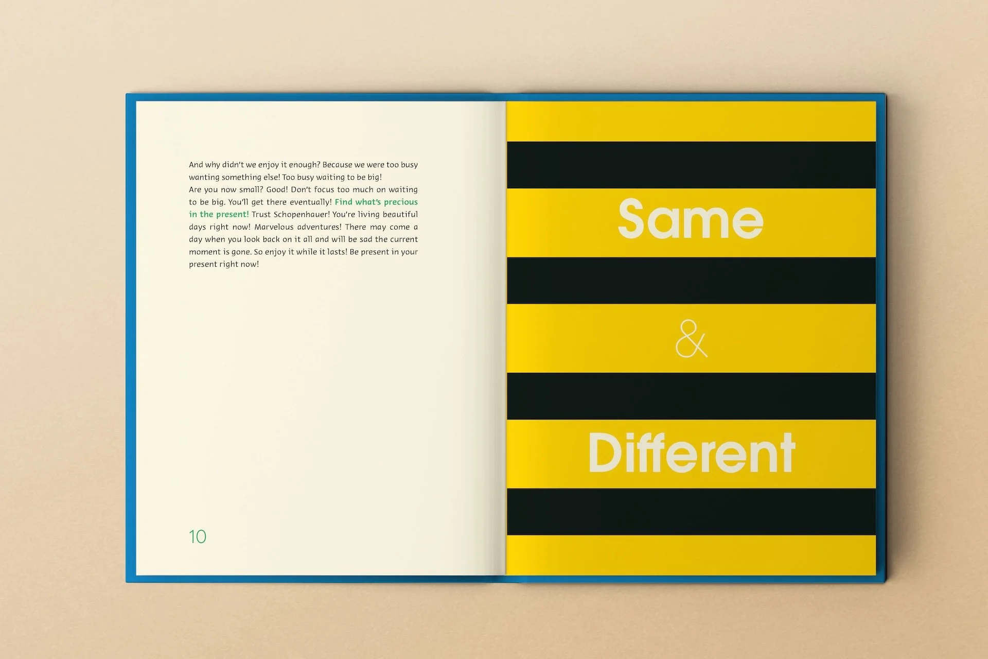
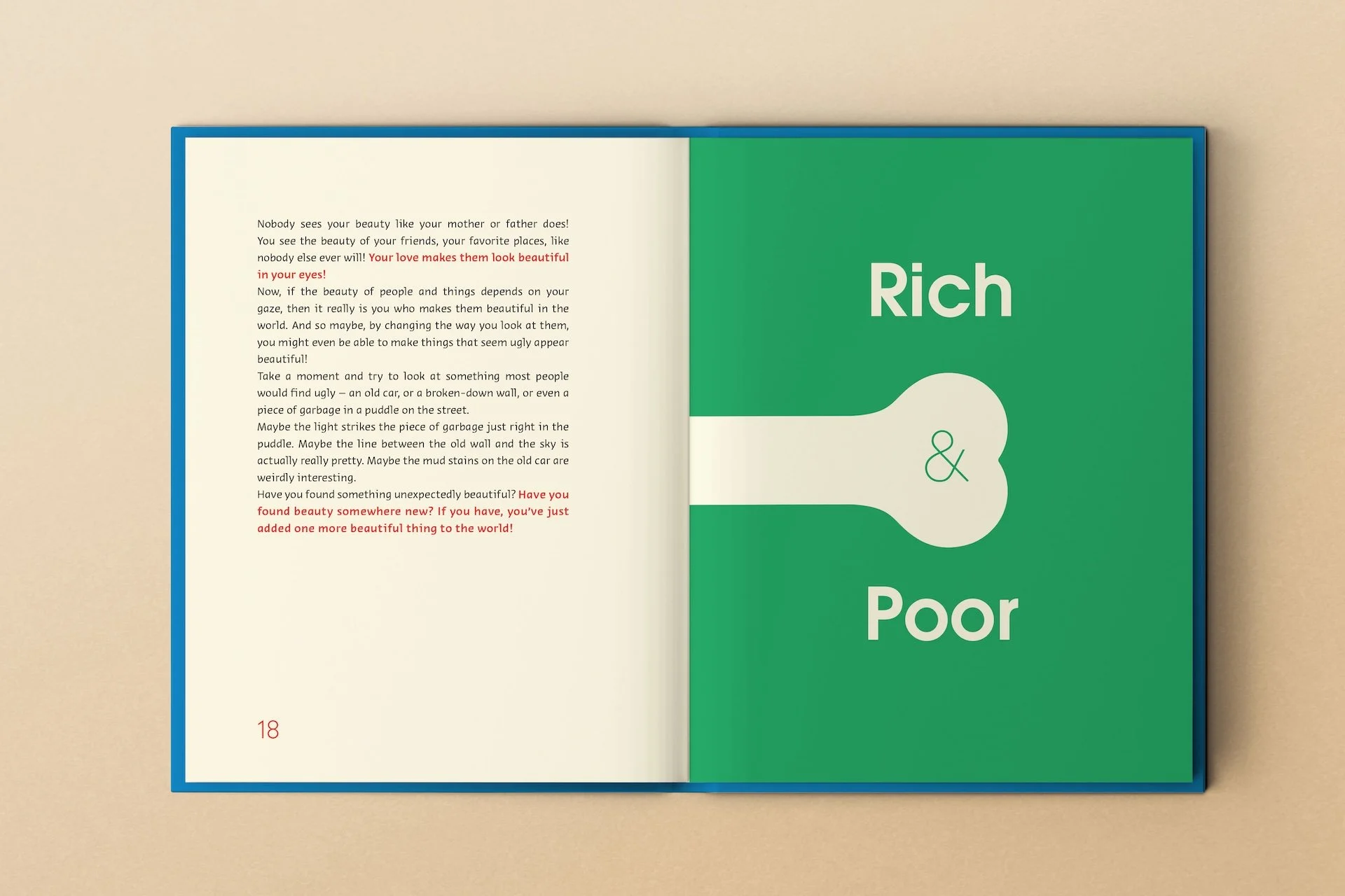
The structure follows a sequence of pairings: big and small, same and different, beautiful and ugly, rich and poor, good and evil, asleep and awake. These categories feel familiar, but the book treats them as starting points rather than conclusions.
Early on, it poses one of philosophy’s oldest questions
“Why is there something rather than nothing?”
The sentence is plain. The implications are not. The book offers no answer, treating the act of wondering as meaningful in itself.
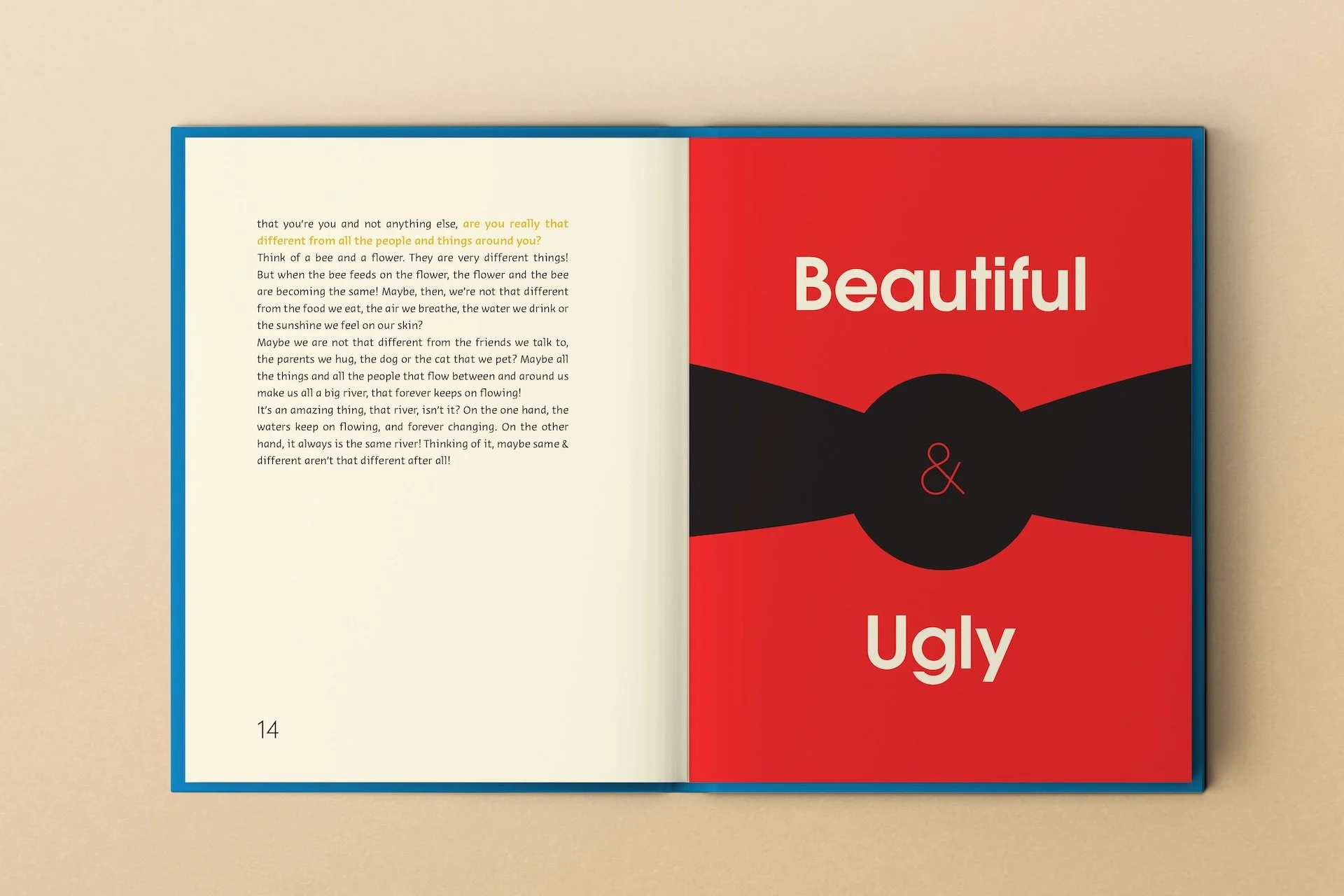
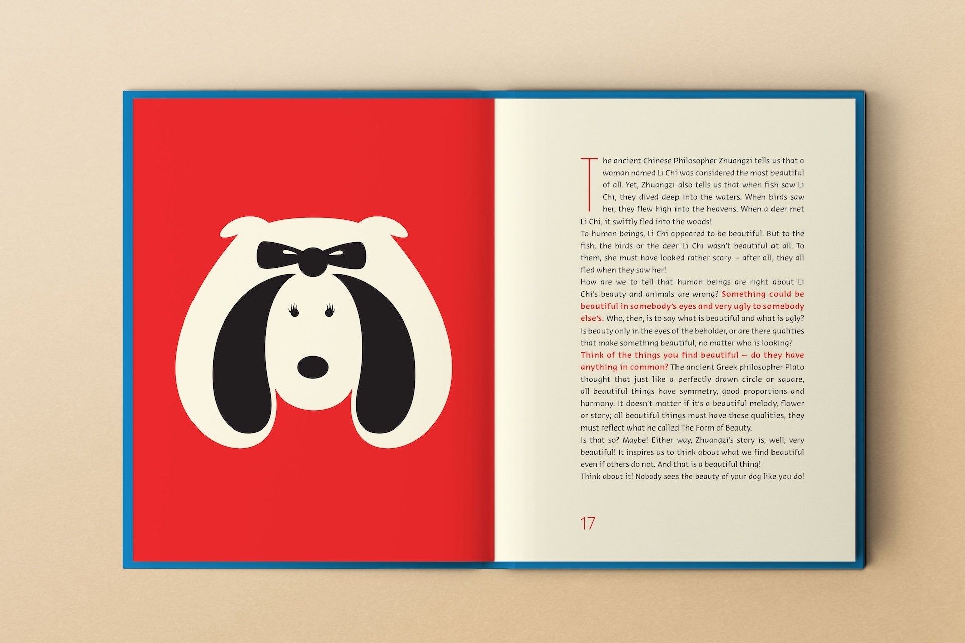
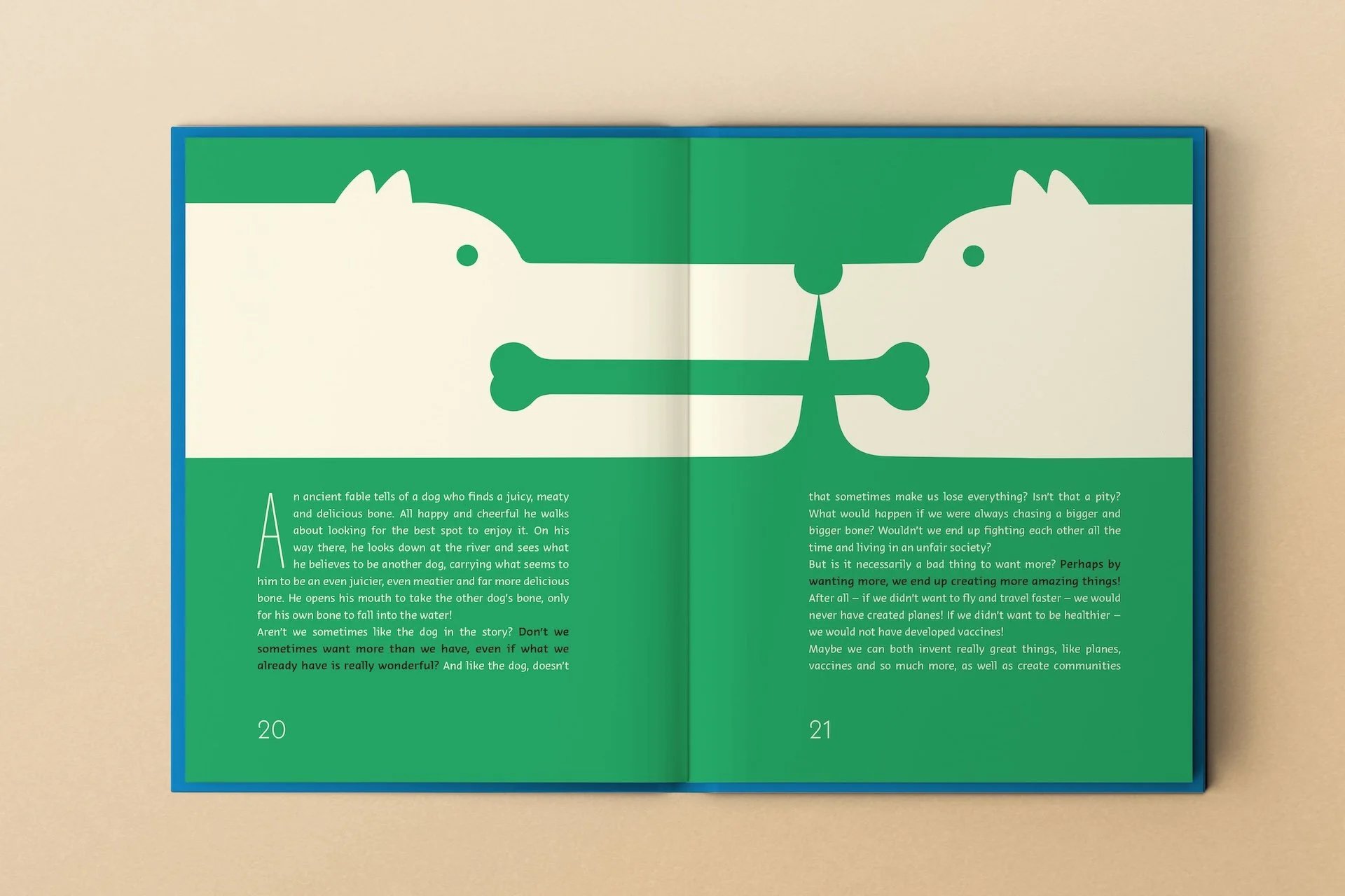
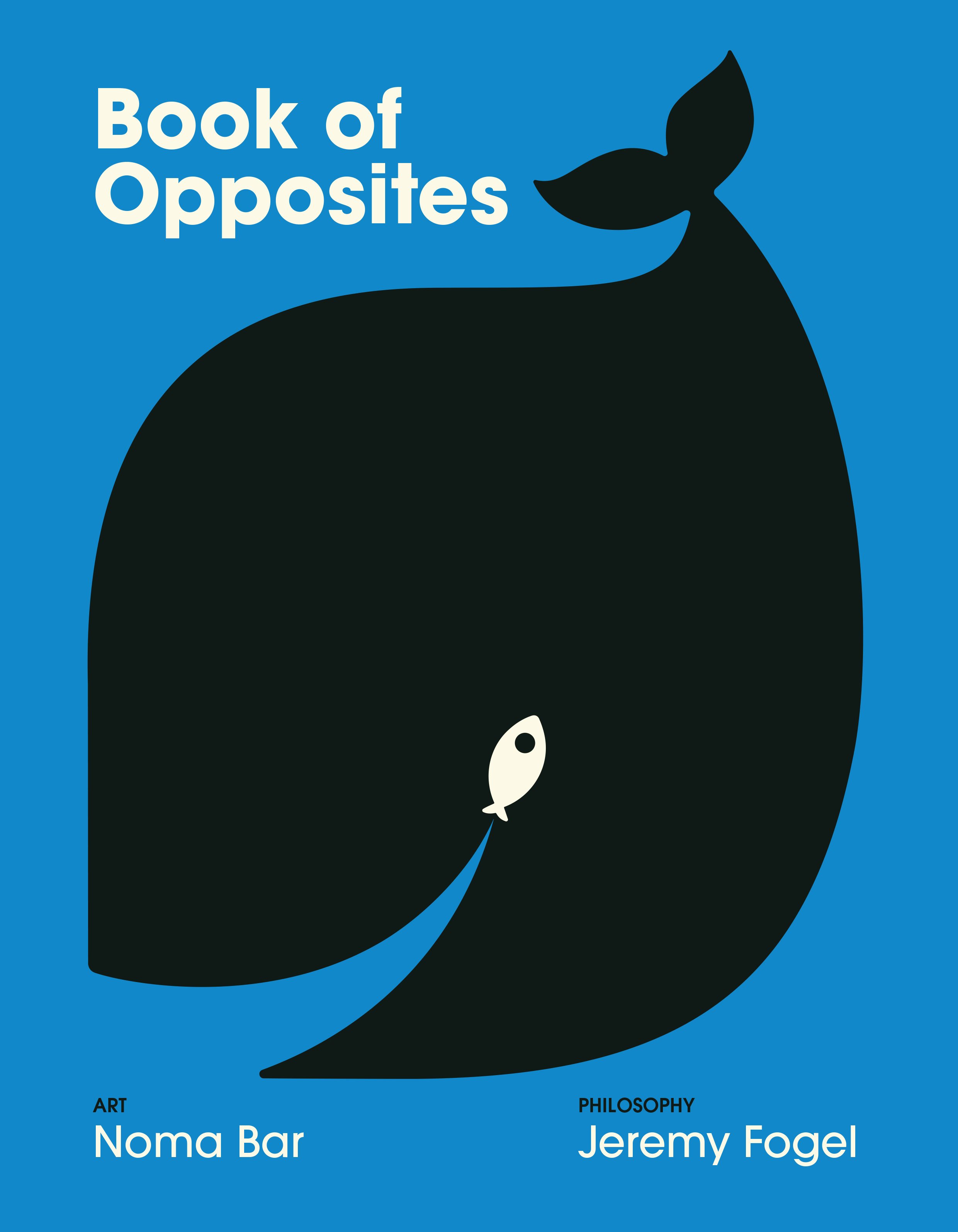
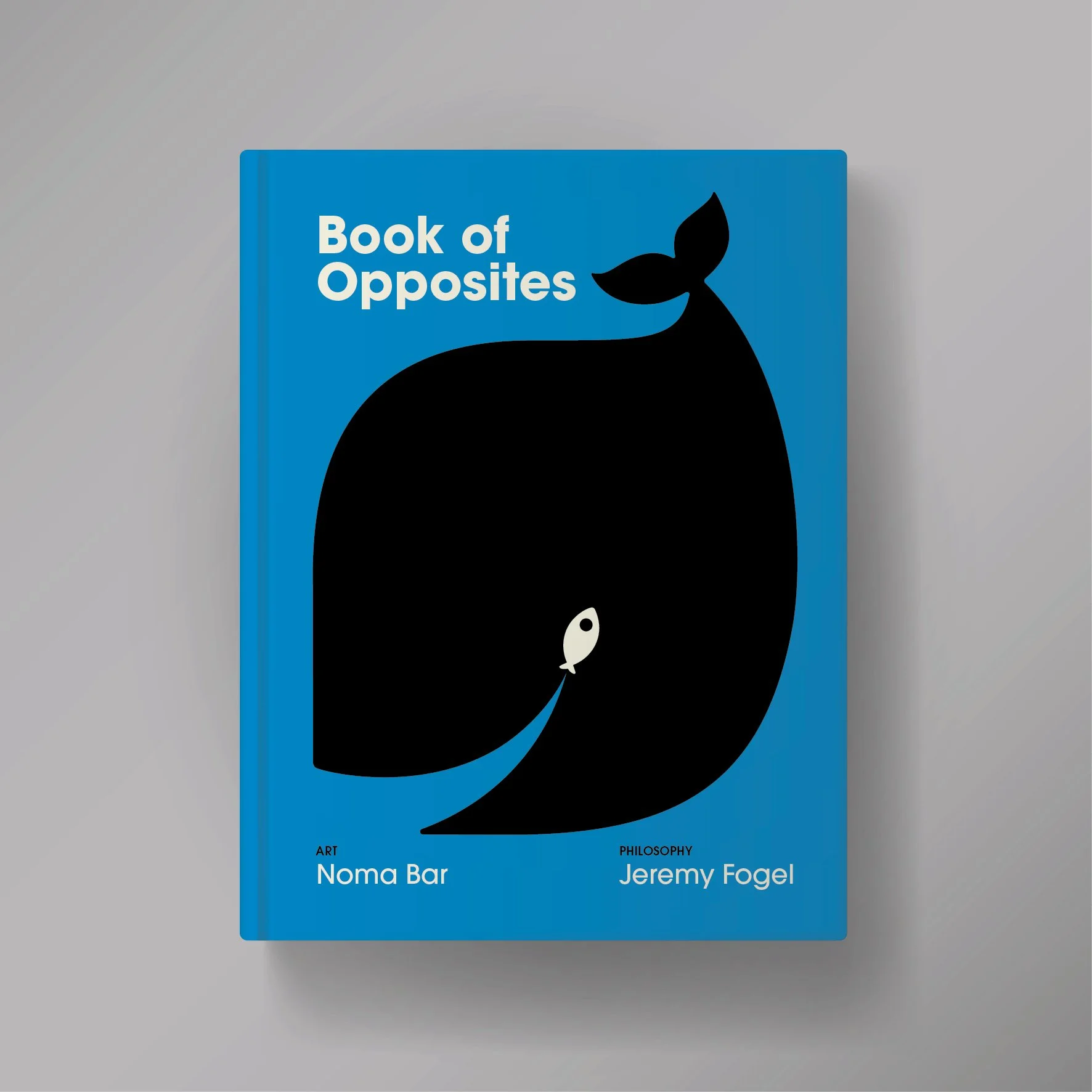
Noma Bar’s illustrations carry much of this intellectual weight. Known for a graphic language built on negative space and visual reversal, Noma creates images that shift depending on how they are read. A single form may resolve into two meanings. A repeated shape may suggest sameness while quietly revealing difference.
The book later states that contrasting ideas
“contradict and complement each other to create a Unity of Opposites.”
Noma’s images make this principle visible. Meaning emerges where two readings overlap, not where one replaces the other. The visual experience mirrors the philosophical one.
The graphics remain spare throughout. Flat colour, sharp edges, and repetition dominate. There is no decorative excess. This restraint creates space for attention. The images ask the reader to pause and look again, aligning with a broader refusal to over-explain.
Jeremy Fogel’s writing matches this visual economy. Philosophers appear often—Heraclitus, Plato, Kant, Rousseau, Zhuangzi—but never as final authorities. They enter the text as people who asked difficult questions rather than supplied finished answers. Philosophy appears as an activity rather than a body of knowledge.
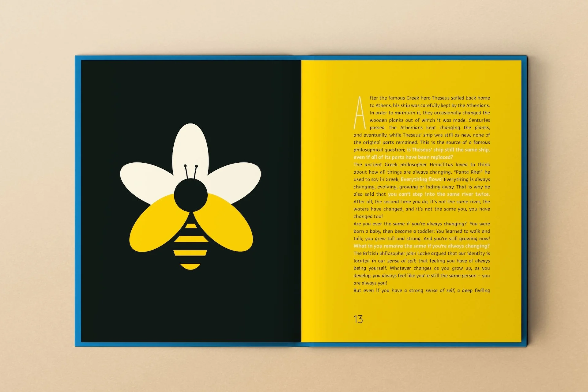
In the section on sameness and change, the book recounts the paradox of Theseus’ ship, whose parts are replaced over time until none of the original material remains. The question follows naturally: is it still the same ship? Identity emerges as something felt rather than measured. In the chapter on good and evil, Immanuel Kant appears through a simple scenario involving cookies. Is it fair for one child to take an extra cookie if another child will go without? Moral reasoning grows from lived experience.
Throughout the book, philosophy remains grounded. The text insists that thinking begins with noticing. It reminds readers that “philosophy begins in wonder.” Each chapter starts with something obvious and ends with something unsettled.
The closing sections, drawing on Zhuangzi’s butterfly dream, refuse resolution entirely.
“Are you awake right now or are you dreaming?”
One of the book’s quieter claims is that children already think philosophically. They notice unfairness, change, contradiction, and loss. The Book of Opposites does not introduce philosophy as a new discipline. It gives structure to a habit of mind that already exists.
By aligning visual form and philosophical content, the book becomes an exercise in attention. It teaches readers how to hold two ideas at once, how to look twice, and how to accept that understanding often lives in the space between opposites. It resists haste and avoids instruction. That restraint feels deliberate—and deeply philosophical.